Skip to content

Use a shared 12px border radius for tables and content cards - #101466

Draft
MelvinBot wants to merge 4 commits into
mainfrom
claude-borderRadius12TablesAndCards
Draft

MelvinBot wants to merge 4 commits into
mainfrom
claude-borderRadius12TablesAndCards

Conversation

@MelvinBot

@MelvinBot MelvinBot commented Sep 17, 2026

Copy link
Copy Markdown
Contributor

Explanation of Change

Tables and content cards are both "a surface with a different background that wraps content", but they used two different corner radii: tables were 8px and content cards were 16px. This harmonizes them on a single 12px value.

Adds one new variable, componentBorderRadiusCardAndTable: 12, in src/styles/variables.ts and applies it to the shared styles that every affected surface already routes through, so this is a value change rather than a sweep of individual screens:

  • styles.tableTopRadius / styles.tableBottomRadius (812) — the outer corners of every table: components/Table (Workspace editor, Domain editor and Account tables), the Spend/Search tables, the report transaction table, and the RHP tables such as Merge Expense and Add expense to report. The table loading skeletons use the same styles, so they stay in sync.
  • StyleUtils.getSearchTableHighlightBorderRadius (812) — the row highlight animation on narrow layouts, so it matches the table it sits in.
  • styles.cardSectionContainer (1612) — the Section component, which renders the content cards in the Workspace editor (Overview, Reports, Time, etc.), the Domain editor (SAML) and Account. This also covers the trip/reservation detail cards, which are Sections.
  • styles.widgetContainer (1612) — the widget cards on the Home page.
  • styles.transactionListItemStyle (hardcoded 8 → the new variable) — transaction rows. Inside Search tables this radius is already overridden per row, so the visible effect is on the standalone lists such as Add expense to report.

Chat / Inbox preview cards

Per review feedback, the same 12px is applied to the report-action preview cards that appear in a chat. Each of these cards stacks two views that both carry the corner, so they are changed together:

  • styles.reportContainerBorderRadius (1612) — the inner cardBG/hover wrapper of the expense report and invoice preview, its empty and no-access placeholder states, and the scanning/whisper wrapper on the single expense preview.
  • styles.borderedContentCardLarge → renamed styles.borderedReportPreviewCard (1612) — the bordered variant of the expense report / invoice preview card. It had exactly one consumer (MoneyRequestReportPreviewBody), and leaving a key named Large on the 12 value while componentBorderRadiusLarge stays 16 would be misleading, hence the rename.
  • styles.moneyRequestPreviewBox (1612) — the single expense preview card in a chat, the transaction cards inside the report preview's carousel, and the inner surface of the trip room preview. The carousel cards had to move with their container, otherwise the inner corners would end up rounder than the card holding them.
  • styles.reportPreviewBox (1612) — the outer corner of the trip / travel room preview.
  • styles.reportActionItemImages (hardcoded 12componentBorderRadiusCardAndTable - reportActionItemImagesInset, so 8) — the receipt thumbnail row at the top of a preview card. It is inset 4px from the card edge by reportActionItemImagesContainer, so its radius has to be the card radius minus that inset to stay concentric; the old 12 was 16 - 4. The 4 is now a shared reportActionItemImagesInset constant used by both styles so the two can't drift apart again.

Expense reports and invoices share one component — ActionContentRouter routes every REPORT_PREVIEW action to MoneyRequestReportPreview — so one radius covers both.

Left untouched: componentBorderRadius: 8 and componentBorderRadiusLarge: 16 themselves, styles.borderRadiusComponentLarge (a generic 16px utility used by eight-plus unrelated screens, which only shows up here as the trip card's inner reservations box), and styles.reportActionItemImagesMore (the "+N more receipts" badge corner, which is decorative rather than concentric with the card).

Fixed Issues

$ #101462
PROPOSAL: #101462 (comment)

Tests

// TODO: The human co-author must fill out the tests you ran before marking this PR as "ready for review"
// Please describe what tests you performed that validates your changed worked.

  • Verify that no errors appear in the JS console

Offline tests

Not applicable — this is a style-value change with no network behavior.

QA Steps

// TODO: The human co-author must fill out the QA tests you ran before marking this PR as "ready for review".
// Please describe what QA needs to do to validate your changes and what areas do they need to test for regressions.

  • Verify that no errors appear in the JS console

PR Author Checklist

  • I linked the correct issue in the ### Fixed Issues section above
  • I wrote clear testing steps that cover the changes made in this PR
    • I added steps for local testing in the Tests section
    • I added steps for the expected offline behavior in the Offline steps section
    • I added steps for Staging and/or Production testing in the QA steps section
    • I added steps to cover failure scenarios (i.e. verify an input displays the correct error message if the entered data is not correct)
    • I turned off my network connection and tested it while offline to ensure it matches the expected behavior (i.e. verify the default avatar icon is displayed if app is offline)
    • I tested this PR with a High Traffic account against the staging or production API to ensure there are no regressions (e.g. long loading states that impact usability).
  • I included screenshots or videos for tests on all platforms
  • I ran the tests on all platforms & verified they passed on:
    • Android: Native
    • Android: mWeb Chrome
    • iOS: Native
    • iOS: mWeb Safari
    • MacOS: Chrome / Safari
  • I verified there are no console errors (if there's a console error not related to the PR, report it or open an issue for it to be fixed)
  • I followed proper code patterns (see Reviewing the code)
    • I verified that comments were added to code that is not self explanatory
    • I verified that any new or modified comments were clear, correct English, and explained "why" the code was doing something instead of only explaining "what" the code was doing.
    • I verified any copy / text that was added to the app is grammatically correct in English. It adheres to proper capitalization guidelines (note: only the first word of header/labels should be capitalized), and is either coming verbatim from figma or has been approved by marketing (in order to get marketing approval, ask the Bug Zero team member to add the Waiting for copy label to the issue)
  • If a new code pattern is added I verified it was agreed to be used by multiple Expensify engineers
  • If a new CSS style is added I verified that:
    • A similar style doesn't already exist
    • The style can't be created with an existing StyleUtils function (i.e. StyleUtils.getBackgroundAndBorderStyle(theme.componentBG))
  • If new assets were added or existing ones were modified, I verified that:
    • The assets are optimized and compressed (for SVG files, run npm run compress-svg)
    • The assets load correctly across all supported platforms.
  • If the PR modifies code that runs when editing or sending messages, I tested and verified there is no unexpected behavior for all supported markdown - URLs, single line code, code blocks, quotes, headings, bold, strikethrough, and italic.
  • If the PR modifies a generic component, I tested and verified that those changes do not break usages of that component in the rest of the App (i.e. if a shared library or component like Avatar is modified, I verified that Avatar is working as expected in all cases)
  • If the PR modifies a component related to any of the existing Storybook stories, I tested and verified all stories for that component are still working as expected.
  • If the PR modifies a component or page that can be accessed by a direct deeplink, I verified that the code functions as expected when the deeplink is used - from a logged in and logged out account.
  • If the PR modifies the UI (e.g. new buttons, new UI components, changing the padding/spacing/sizing, moving components, etc) or modifies the form input styles:
    • I verified that all the inputs inside a form are aligned with each other.
    • I added Design label and/or tagged @Expensify/design so the design team can review the changes.
  • I added unit tests for any new feature or bug fix in this PR to help automatically prevent regressions in this user flow.
  • If the main branch was merged into this PR after a review, I tested again and verified the outcome was still expected according to the Test steps.

AI Tests

Run locally by MelvinBot on this branch:

  • npm run typecheck — passed.
  • npm run lint-changed — passed.
  • npm run react-compiler-compliance-check on the touched components — passed.
  • npm test -- tests/unit/useSearchTableItemHighlightTest.ts tests/unit/useListItemHighlightTest.ts — 12 tests passed (these are the tests that assert on the highlight border radius).
  • npm test -- tests/ui/MoneyRequestReportPreview.test.tsx tests/ui/TransactionPreviewContentTest.tsx tests/ui/FlightTripDetailsTest.tsx tests/ui/ReportActionItemTest.tsx — 253 tests passed (the suites covering the chat preview cards).
  • Android verification of the tables and content cards — passed, screenshots here.
  • Not run: browser verification of the chat preview cards. The CI web session handed to that run was stuck on a blank, unresponsive page and could not be recovered, so no screenshots were captured. Visual confirmation of the new radius on the chat preview cards is still needed.
  • Not run: scripts/findUnusedStyles.ts — could not be executed in this environment. The one renamed style key (borderedContentCardLargeborderedReportPreviewCard) was checked by hand: it had a single consumer, which was updated, and no references to the old name remain.

Screenshots/Videos

Android: Native
Android: mWeb Chrome
iOS: Native
iOS: mWeb Safari
MacOS: Chrome / Safari

…bles and content cards

Co-authored-by: Shawn Borton <shawnborton@users.noreply.github.com>
@MelvinBot
MelvinBot requested a review from a team September 17, 2026 20:25
@melvin-bot melvin-bot Bot added Melvin-Test-Android Melvin-Test-Web Triggers Melvin to run the testing steps of the PR on web labels Sep 17, 2026
@github-actions

Copy link
Copy Markdown
Contributor

🚧 shawnborton has triggered a test Expensify/App build. You can view the workflow run here.

@github-actions

This comment has been minimized.

@MelvinBot

Copy link
Copy Markdown
Contributor Author

The typecheck failure is not caused by this PR — main is broken. I did not push a fix.

Root cause: two PRs that each passed on their own collided on main:

The migration PR merged second, so its sweep never saw those two new call sites. They are still missing the required property on main today, at tests/unit/ModifiedExpenseMessageTest.ts:460 and tests/unit/ModifiedExpenseMessageTest.ts:491 — exactly the two errors CI reported here.

It is already tracked: Investigate workflow job failing on main: typecheck / typecheck, opened 34 minutes before this PR's typecheck run.

Next step: nothing to change on this branch. Once main is green again, re-run the job and typecheck will pass. Merging main in right now would only pull the break onto this branch.

Why this isn't this PR's fault
  • This PR only changes style values and two components that consume them. It never touches ModifiedExpenseMessage or its test.
  • On this branch alone, getForReportAction still carries the old optional reportAttributes? parameter and the test file contains no reference to movedFromReportName, so the branch typechecks clean — which matches the local run recorded in the PR body.
  • CI typechecks the PR-merged-with-main commit. Both failing files resolve to main's version in that merge, which is where the error comes from. The PR's typecheck run started at 20:28 UTC, after the migration PR landed on main at 19:54 UTC.

The other two non-green checks are also unrelated to the code: Check independent approval is failing because the PR does not have an independent approval yet, and ESLint check was still running when I looked.


view run

@shawnborton

Copy link
Copy Markdown
Contributor

@MelvinBot please also implement this change for expense report/invoice/trip previews found in the Inbox in expenses chats.

@MelvinBot

Copy link
Copy Markdown
Contributor Author

Still nothing to fix on this branch — both real failures come from main, and one of them has already been fixed there. I pushed no change.

ESLint check finished failing since my last comment, so here is the updated picture.

1. typecheckmain is still broken, and this is what blocks the PR

Unchanged from my previous comment. [Phase 2] Part 4 - Migrate deprecatedGetReportName to getReportName in libs made movedFromReportName a required property of getForReportAction (src/libs/ModifiedExpenseMessage.ts:294), but its sweep missed the two call sites that Render the Concierge system message for an automatic distance rate change had just added. Those two still lack the property on main right now, at tests/unit/ModifiedExpenseMessageTest.ts:460 and tests/unit/ModifiedExpenseMessageTest.ts:491. Tracked by Investigate workflow job failing on main: typecheck / typecheck, still open.

2. ESLint check — same kind of collision, but already fixed on main

The single error is no-unsafe-type-assertion at tests/unit/pages/workspace/accounting/netsuite/NetSuiteTokenInputFormTest.tsx:117 — another file this PR does not touch.

Thread beta overrides into the remaining util call sites added a required isBetaEnabledOrUnknown member to UsePermissions (src/hooks/usePermissions.ts:12). That NetSuite test mocked usePermissions with an object supplying only isBetaEnabled and cast it with as ReturnType<typeof usePermissions>, so the assertion became unsafe the moment the type grew a member.

[No QA] Add a non-production link back to token-based (SOAP) NetSuite setup then deleted that mock, 11 minutes after this PR's lint job started. Current main contains zero occurrences of the cast, so this error no longer exists there.

Next step: wait for the typecheck break on main to be fixed, then merge main into this branch once. That picks up both fixes together and the PR should go green. Merging main right now would clear the lint error but import the still-live typecheck break, so it is not worth doing yet.

Timeline, and why none of this comes from this PR

This PR changes only style values and the two components that consume them. It touches neither ModifiedExpenseMessage, nor usePermissions, nor any test file.

  • 19:52:29 — \#100061 lands; UsePermissions gains a required member, making the NetSuite test's cast unsafe
  • 19:54:10 — \#98047 lands; movedFromReportName becomes required, so two test call sites now type-error
  • 20:26 — this PR's ESLint check starts against that main
  • 20:28 — this PR's typecheck starts against that main
  • 20:37:31 — \#101283 lands, removing the offending mock, so lint is fixed on main
  • now — main is 10 commits further along: lint clean, typecheck still broken

CI lints and typechecks the PR-merged-with-main commit. Both failing files resolve to main's version in that merge rather than this branch's, which is why the branch passes these same checks locally.

Check independent approval is the third red check. It only reflects that the PR does not have an independent approval yet.


view run

@MelvinBot

MelvinBot commented Sep 17, 2026

Copy link
Copy Markdown
Contributor Author

🤖 Android test steps verification results: ✅ pass

All 7 affected surfaces (home widgets, workspace/account Section cards, tables, money-request transaction rows, and the unreported-expense list) render with the new shared 12px rounded corners with clean clipping and no layout breaks. No JS console errors were observed during the run.

Zoomed rounded corners of unreported expense row

Step Status
VERIFY 1: No JS console / app errors during the runCaptured the full app.log via agent-device logs start; grepped for AndroidRuntime / FATAL EXCEPTION / RCTFatal / RedBox / console.error / LogBox markers and found none. Only benign environment noise was present (CameraX "No available camera can be found" — the emulator has no camera — and transient Onyx retry messages during initial sign-in/onboarding, unrelated to this styling PR).
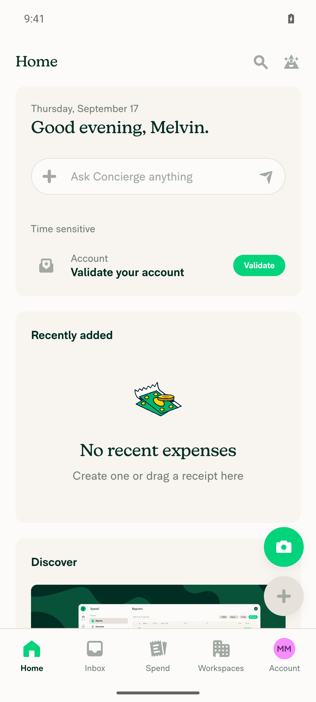
VERIFY 2: Home page widget cards (styles.widgetContainer) render with rounded corners and correct content clippingHome page "Time sensitive/Account", "Recently added", and "Discover" cards all show clearly rounded corners with content clipped cleanly inside.
Home page widget cards with rounded corners
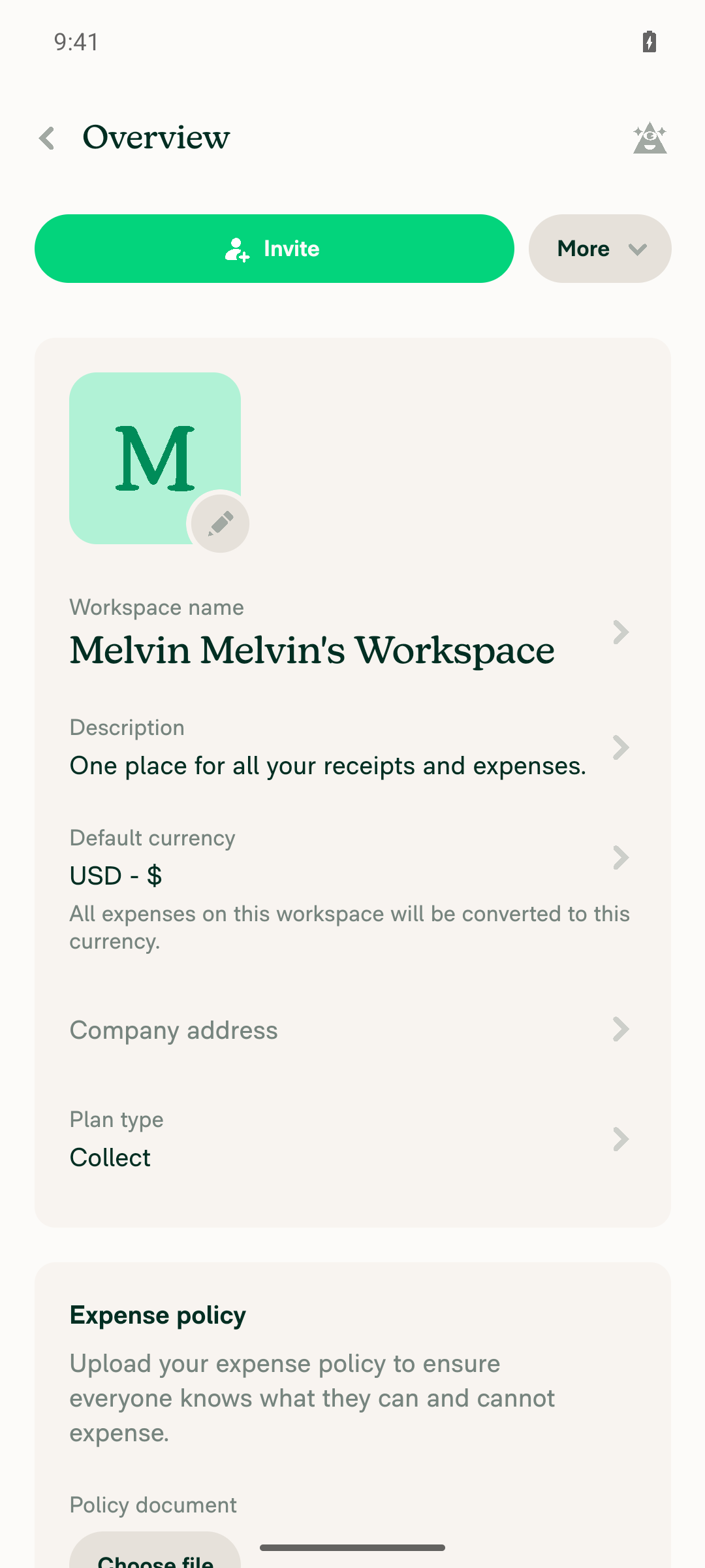
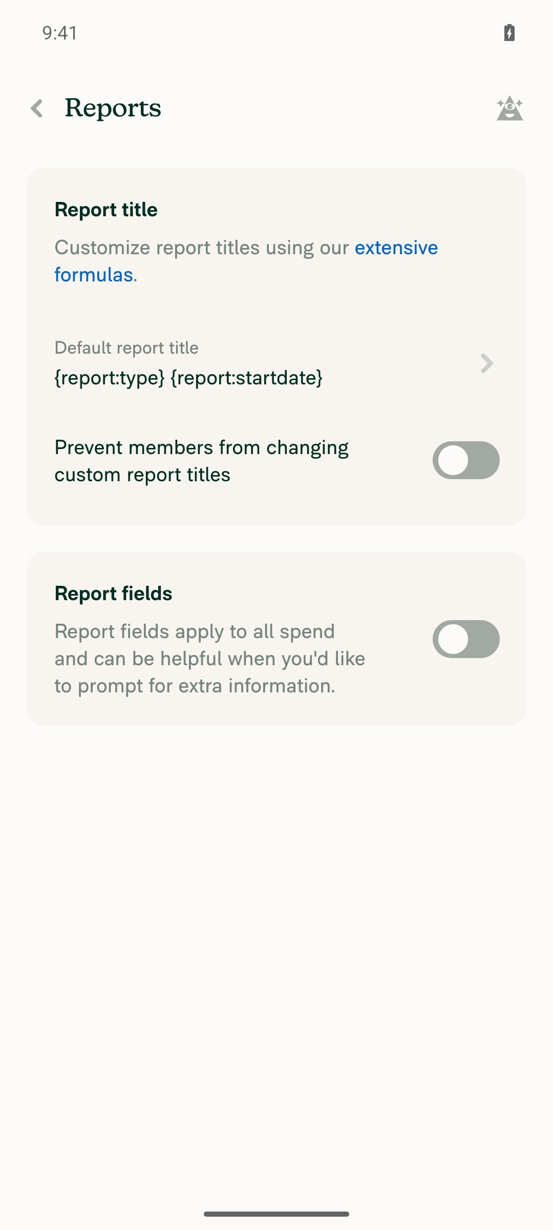
VERIFY 3: Workspace editor content cards (styles.cardSectionContainer / Section component) render with rounded cornersWorkspace > Overview shows the main details card and the "Expense policy" card with rounded corners; Workspace > Reports shows "Report title" and "Report fields" cards with rounded corners.
Workspace Overview Section cards with rounded corners
Workspace Reports Section cards with rounded corners
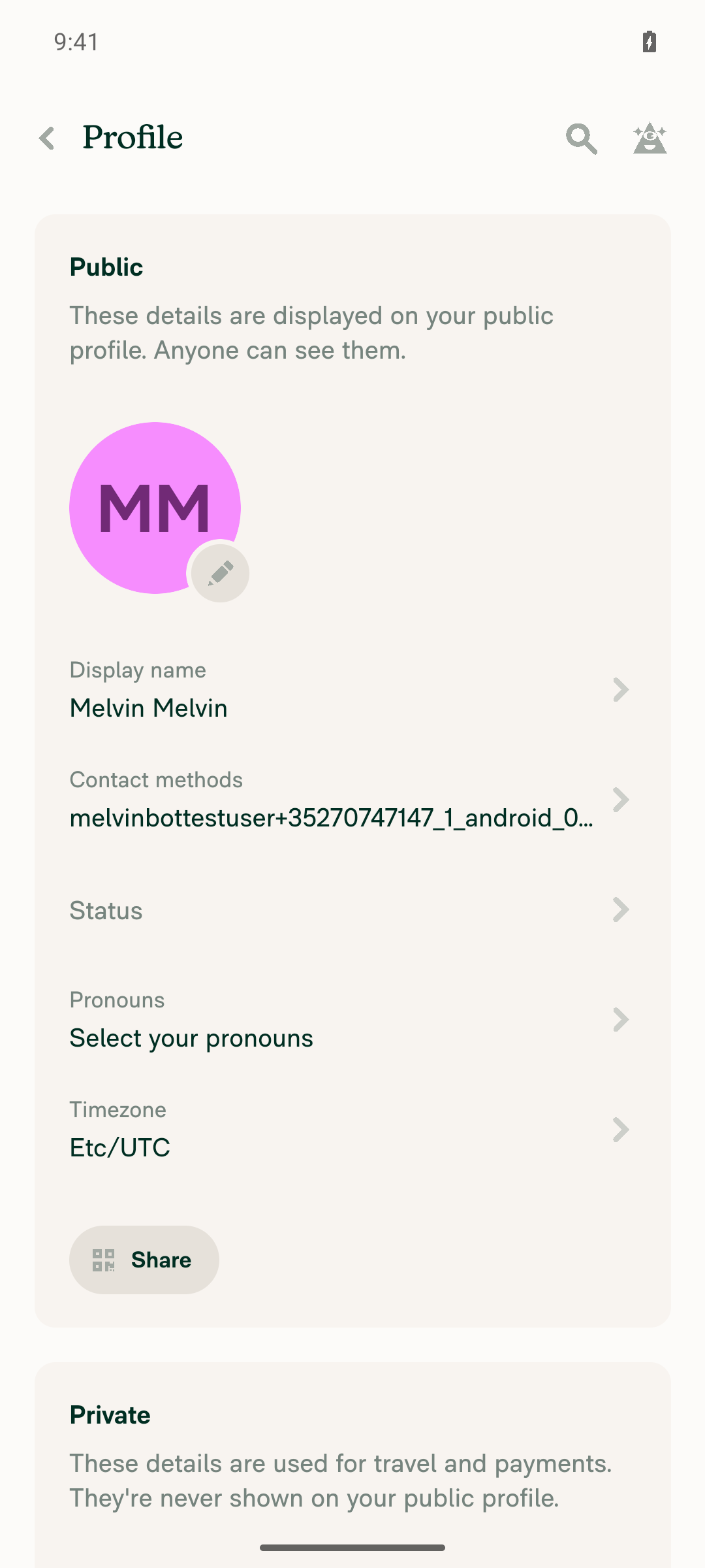
VERIFY 4: Account settings content cards using the Section component render with rounded cornersAccount > Profile shows the "Public" and "Private" Section cards with rounded corners, matching the workspace editor cards.
Account Profile Section cards with rounded corners
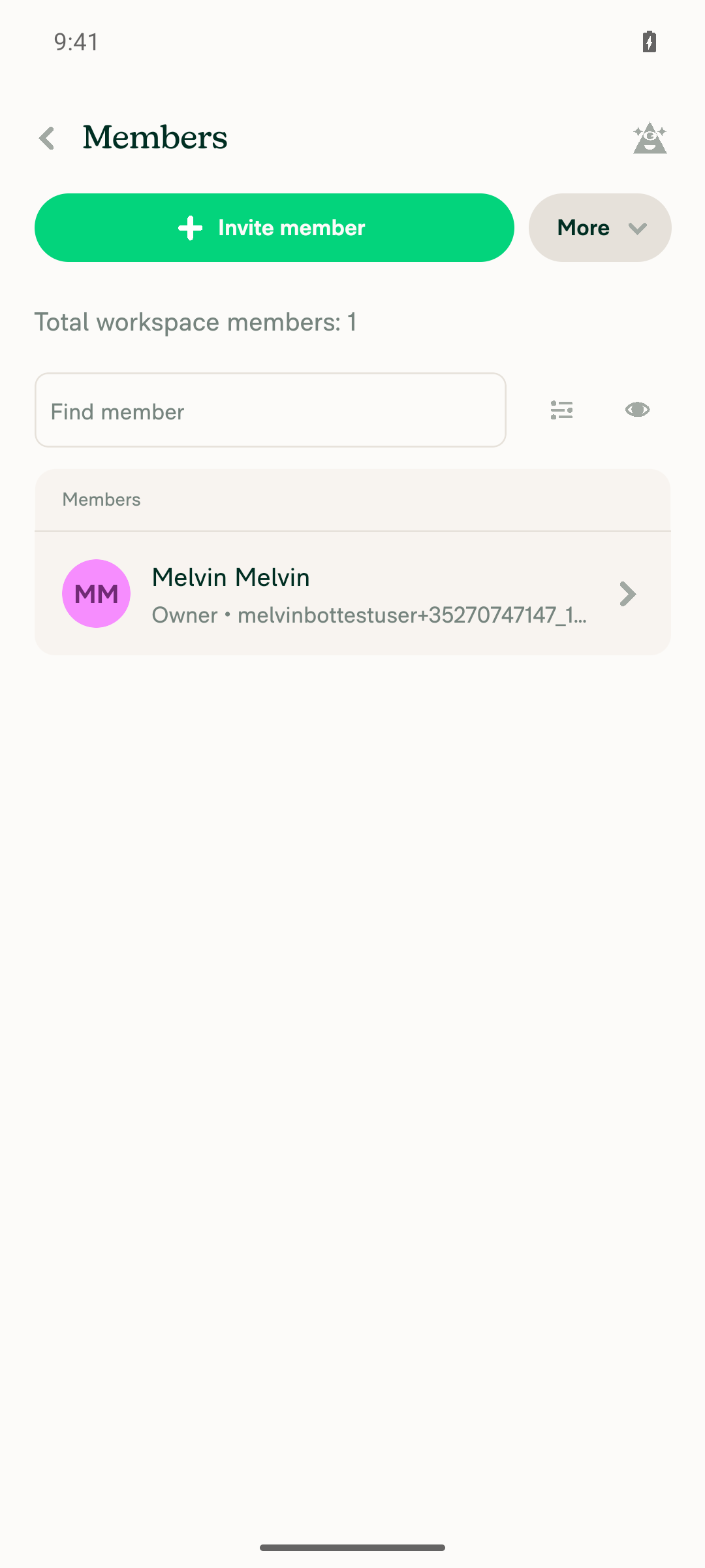
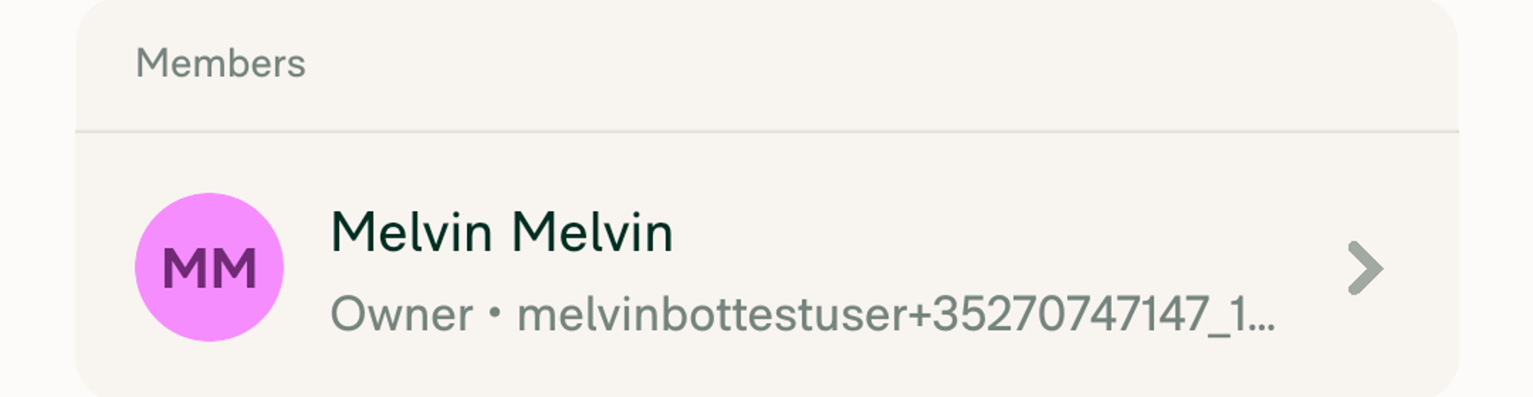
VERIFY 5: A table using styles.tableTopRadius / tableBottomRadius has rounded outer top/bottom corners with rows clipped insideWorkspace > Members table: zoomed crops confirm rounded top corners around the "Members" header row and rounded bottom corners around the last member row, with row content clipped cleanly inside the outer radius.
Workspace Members table
Zoomed top corners of Members table
Zoomed bottom corners of Members table
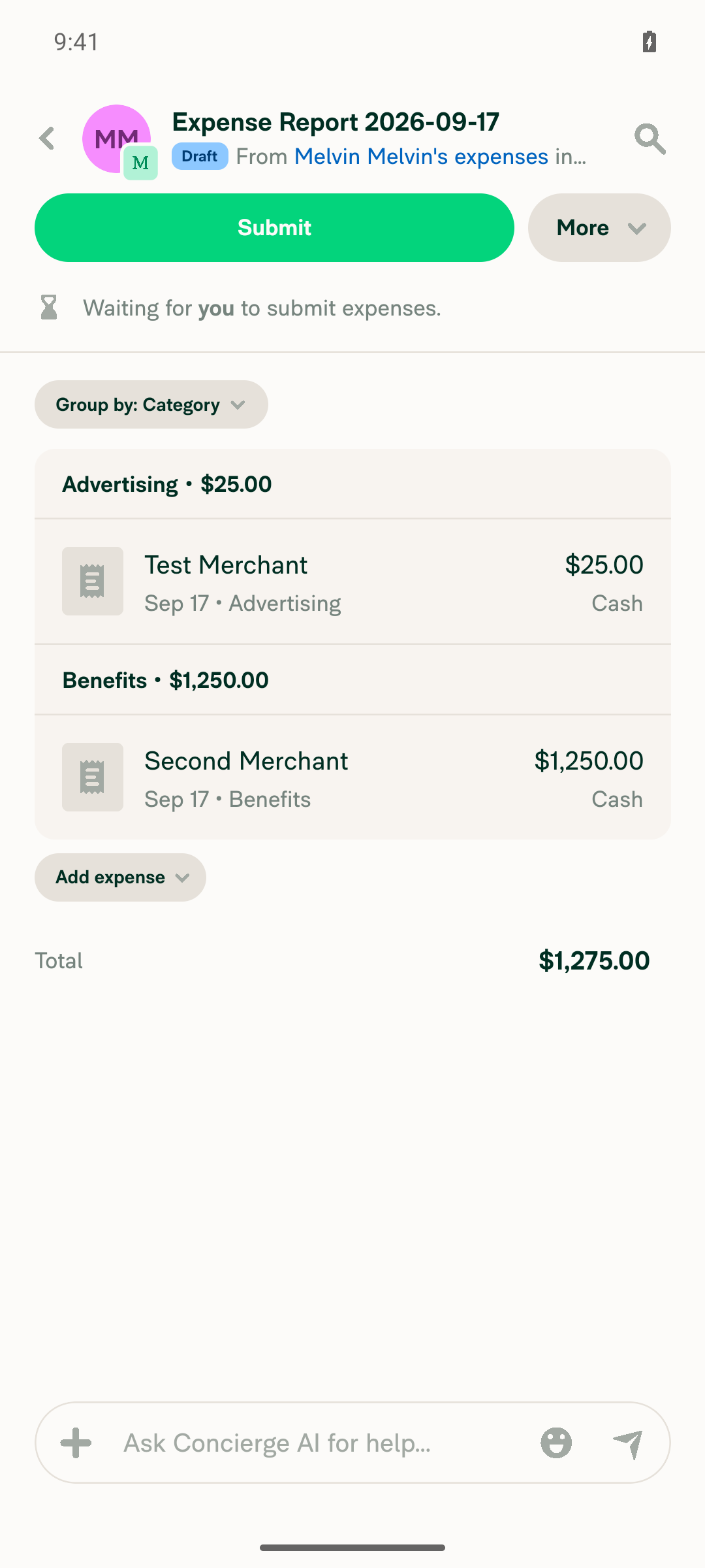
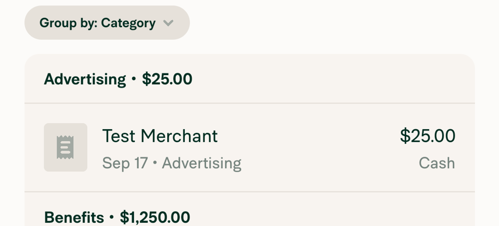
VERIFY 6: A money request report's transaction rows (transactionListItemStyle / MoneyRequestReportTransactionItem) render with rounded corners and no visual breakCreated a draft expense report with two expenses (Advertising and Benefits categories) and opened the report. The grouped transaction list ("Group by: Category") shows the outer container with rounded top corners above the first category header and rounded bottom corners below the last transaction row, with no overlap or clipping issues between rows.
Money request report with two transaction rows
Zoomed rounded top corners of transaction list
Zoomed rounded bottom corners of transaction list
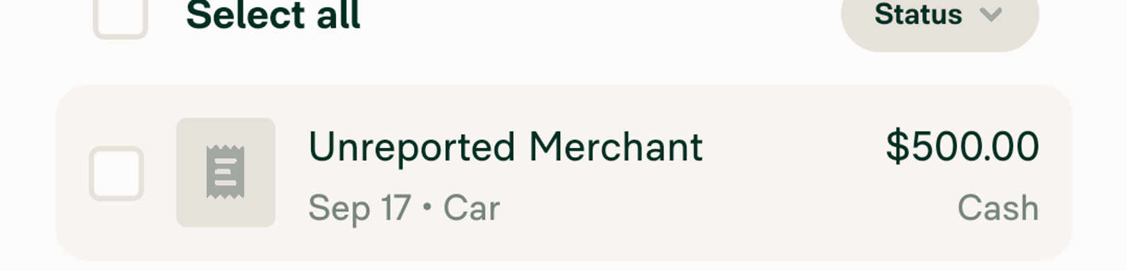
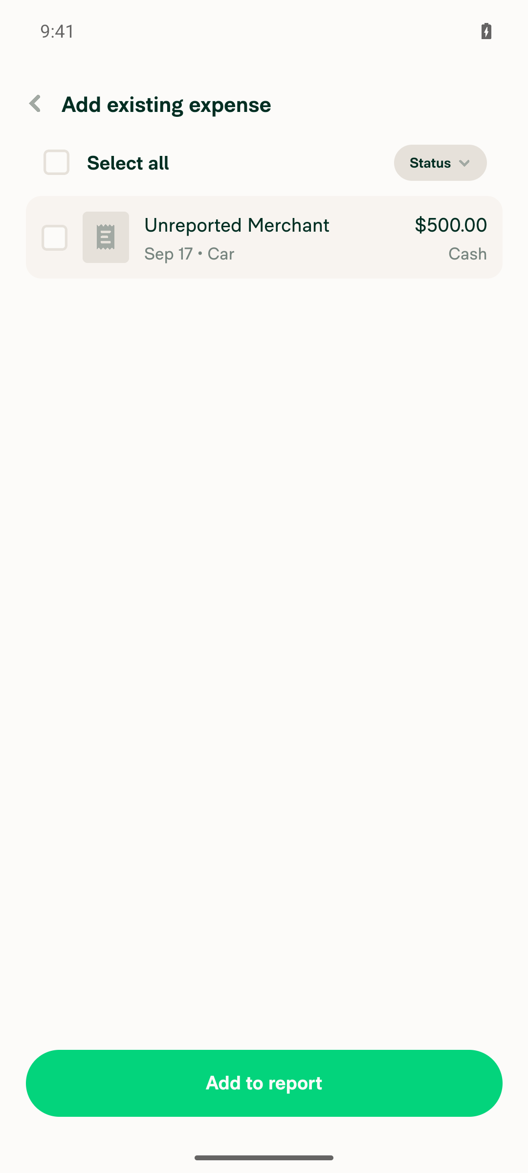
VERIFY 7: The "Add expense to report" list (UnreportedExpenseListItem) renders rows with rounded cornersCreated a second, separate draft report with an unreported expense, then from the first report used Add expense > Add existing expense. The resulting UnreportedExpenseListItem row ("Unreported Merchant, $500.00") renders with clearly rounded corners on the row container.
Add existing expense list with rounded row
Zoomed rounded corners of unreported expense row

The PR's Tests section is still a TODO placeholder, so the steps above were derived from the surfaces listed in the Explanation of Change. Verified on standalone Android NewDot (developmentDebug APK), not HybridApp.


view run · view recording

…reviews

Co-authored-by: Shawn Borton <shawnborton@users.noreply.github.com>
@MelvinBot

Copy link
Copy Markdown
Contributor Author

Done — pushed as efb6578. The chat preview cards now use the same 12px as tables and content cards.

Each preview card stacks two views that both carry the corner, so they move together:

Style Was Now Surface
reportContainerBorderRadius 16 12 Inner cardBG/hover wrapper of the expense report + invoice preview, its empty and no-access states, and the scanning/whisper wrapper on the single expense preview
borderedReportPreviewCard 16 12 Bordered variant of the expense report / invoice preview card
moneyRequestPreviewBox 16 12 Single expense preview in a chat, the carousel cards inside the report preview, and the trip preview's inner surface
reportPreviewBox 16 12 Outer corner of the trip / travel room preview
reportActionItemImages 12 8 Receipt thumbnail row at the top of a preview card

Expense reports and invoices share one component — ActionContentRouter sends every REPORT_PREVIEW action to MoneyRequestReportPreview — so one radius covers both. Trip detail cards were already at 12, since they are Sections.

Three judgement calls worth a look

The receipt thumbnail had to go down, not up. It sits 4px inside the card edge, so its radius is the card radius minus that inset — the old hardcoded 12 was 16 - 4. With the card at 12 it becomes 8, otherwise its corner curve would poke past the card's. The 4 is now a shared reportActionItemImagesInset constant used by both styles so they can't drift apart again.

The carousel cards had to move with their container. moneyRequestPreviewBox is both the standalone expense preview in a chat and the transaction cards inside the report preview's carousel. Leaving it at 16 would have made the inner cards rounder than the card holding them.

One rename. borderedContentCardLargeborderedReportPreviewCard. It had exactly one consumer, and a key named Large sitting on 12 while componentBorderRadiusLarge stays 16 is a trap for the next person.

Deliberately left alone: borderRadiusComponentLarge (a generic 16px utility used by eight-plus unrelated screens — it only shows up here as the trip card's inner reservations box), and reportActionItemImagesMore (the "+N more receipts" badge corner, which is decorative rather than concentric with the card).

One gap you should know about. I could not visually verify these cards. typecheck, lint-changed and the React Compiler check all pass, and the four suites covering these components pass (253 tests) — but the CI browser session for this run came up on a blank, unresponsive page and could not be recovered, so there are no screenshots of the new radius on the preview cards. The Android screenshots in my earlier comment cover the tables and content cards from the first commit only, not these. Worth a look on your end before this goes up for review.

@MelvinBot

Copy link
Copy Markdown
Contributor Author

All checks now pass. Nothing to fix, so I pushed no change.

main was repaired by Fix typecheck: pass movedFromReportName in ModifiedExpenseMessageTest at 20:24 UTC, which added the missing movedFromReportName argument to the two test call sites that were breaking typecheck. The latest CI run on this branch picked up that fixed main, and typecheck and ESLint check both went green — confirming the failures were never caused by this PR.

Current state: 34 passing, 0 pending, 1 failing.

The one red check is Check independent approval, and it is not a code problem. Its only failing step is Verify peer review — it simply gates on the PR having an independent human approval, which it does not have yet. That clears when a reviewer approves; there is nothing I can push to fix it.


view run

@shawnborton

Copy link
Copy Markdown
Contributor

@MelvinBot please also implement this for all of the chart container cards in Spend > Insights

Co-authored-by: Shawn Borton <shawnborton@users.noreply.github.com>
@MelvinBot

Copy link
Copy Markdown
Contributor Author

Done — pushed as 3fef26a. The Spend > Insights chart container cards now use the same 12px.

Style Was Now Surface
chartContainer 16 12 The card wrapping every chart in Spend > Insights — Spend over time, Top spenders, Top categories, Top merchants, Violations by submitter — via SearchChartWrapper
chartWebFallback 16 12 The chart's loading spinner surface and its "unable to display chart" state, which sit inside that card

All five Insights charts route through one wrapper, so a single value covers the whole section.

Two things worth a look before you approve

This also moves the charts Concierge posts in chat. chartContainer has three consumers: SearchChartWrapper (Insights) plus the two Victory container paths that render charts embedded in a chat message. I let that move rather than forking the key, because those cards sit next to the chat preview cards this PR already took to 12 — pinning them at 16 would be the odd one out. Say the word if you want Insights scoped on its own key.

I took the chart's own loading surface down too. chartWebFallback is the highlightBG box holding the spinner (and the WebGL-unsupported empty state) inside the chart card. Left at 16 it would be the last 16px surface in the chart stack. It's invisible on Insights, where the card is already highlightBG, but it does show against cardBG in the Home page's Insights widget — which is 12.

Left alone: chartTooltipBox (4 — a tooltip, not a card), pieChartLegendDot (a circle), and the bar chart's roundedCorners={8} (data marks, not a container). No other surface in src/components/Charts/ carries a radius.

One gap, same as last round. I could not visually verify these cards. typecheck passes, lintChanged reports no new violations, and 301 tests across the 19 chart suites pass — but the CI browser session for this run was handed over with a failed onboarding replay and the tab was a blank, unresponsive page for the entire run, so there are no screenshots. The Android screenshots cover the tables and content cards from the first commit only. That leaves both the chat preview cards and these chart cards unconfirmed visually — worth an eye on your end before this goes up for review.

Also: I could not edit the PR description in this environment, so its Explanation of Change and AI Tests sections don't yet mention this commit. The table above is the full scope of it.

@github-actions

Copy link
Copy Markdown
Contributor

🚧 shawnborton has triggered a test Expensify/App build. You can view the workflow run here.

@MelvinBot

Copy link
Copy Markdown
Contributor Author

🤖 There's nothing to fix in code — no check is failing on this PR's changes.

The only red check is Check independent approval, from .github/workflows/verifyPeerReview.yml. It's a review-policy gate, not a build or test failure: it fails because this PR has zero approving reviews. It will stay red until an independent engineer approves. Pushing a commit cannot clear it.

Every other check passed — typecheck, ESLint check, Oxfmt check, React Compiler Compliance, spellcheck, Check for unused styles, Storybook tests, Bun tests, and all 8 test jobs. branch-perf-tests was still running when I looked.

Two things do still need a human, though:

  1. An approving review, to clear the failing gate.
  2. The Tests and QA Steps sections in the PR body are still // TODO placeholders, and most author-checklist boxes are unchecked. Those are yours to fill in — I don't complete them on someone's behalf. Related: the AI Tests section notes that browser verification of the chat preview cards was never captured (the CI web session was stuck on a blank page), so the new 12px radius on those cards is still visually unconfirmed.

Next Steps: Reply with @MelvinBot <your feedback> if you want me to retry the web verification of the chat preview cards, or if a different check has gone red since this comment.


view run

@github-actions

This comment has been minimized.

@shawnborton

Copy link
Copy Markdown
Contributor

@MelvinBot for the cards in More features, can we make those use 12px border radius as well?

CleanShot 2026-09-18 at 11 55 27@2x

Co-authored-by: Shawn Borton <shawnborton@users.noreply.github.com>
@MelvinBot

Copy link
Copy Markdown
Contributor Author

Done — pushed as ebd8477. One line: workspaceSectionMoreFeaturesItem now uses componentBorderRadiusCardAndTable.

Worth knowing: those cards were at 8px, not 16 — they used componentBorderRadiusNormal. So this one is a small step up rather than down like the rest of the PR. The style key has only two consumers, both on the More features page (the card and the invisible grid filler), so nothing else moves. Nothing inside the card is concentric with its corner — every child is inset by the card's 16/20 padding, and the hover highlight is a background on the card itself, so it picks up the new radius for free.

One question for you. onboardingAccountingItem is a byte-for-byte copy of the same card recipe — same cardBG, same 16/20 padding, same componentBorderRadiusNormal. It's the card used for the Onboarding "Accounting" and interested-features steps. Those cards look identical to More features cards today and will now sit at 8 while More features is 12. I left it alone because you asked specifically about More features — say the word and I'll move it too.

Still not verified visually. typecheck passes, lintChanged reports no new violations, and the 26 tests in tests/ui/WorkspaceMoreFeaturesPageTest.tsx pass — but there are no screenshots again.

This is now the third run in a row where the CI web session was unusable, and it's the same failure each time: the prestart onboarding macro diverges on the Skip button of the "What's your work email?" modal (stale ref, complete-onboarding.ad:9), and the browser tab then goes blank and unresponsive. That looks like a bug in the onboarding macro rather than bad luck, and it's worth someone fixing — it's the reason the chat preview cards, the Insights chart cards and now these cards all lack screenshots. The only visual evidence on this PR remains the Android screenshots of the tables and content cards from the first commit.

As before, I couldn't edit the PR description in this environment, so it doesn't mention this commit.

@github-actions

Copy link
Copy Markdown
Contributor

🚧 shawnborton has triggered a test Expensify/App build. You can view the workflow run here.

@shawnborton

Copy link
Copy Markdown
Contributor

@Expensify/design can you take this for a spin please? I think I like this, but I just want to make sure we like it enough to keep making progress (we'll have to find all of the cascading effect of nested border radii, etc).

Sign up for free to join this conversation on GitHub. Already have an account? Sign in to comment

Labels

Melvin-Test-Android Melvin-Test-Web Triggers Melvin to run the testing steps of the PR on web

Projects

None yet

Development

Successfully merging this pull request may close these issues.

2 participants