This project involves analyzing the Production and Inventory sections of the Microsoft AdventureWorks Database, which represents a fictitious bicycle manufacturing company. The database comprises typical transactional data gathered from an Enterprise Resource Planning System. It encompasses various facets of the company, including Human Resources, Product Management, Manufacturing, Purchasing, Inventory, Sales, and Admin. The analysis primarily concentrates on the Manufacturing and Inventory aspects of this dataset. To visualize and analyze this data, Microsoft Power BI was utilized to develop an interactive dashboard, sourcing information directly from SQL Server.
Below we have defined the data model in star structure view:
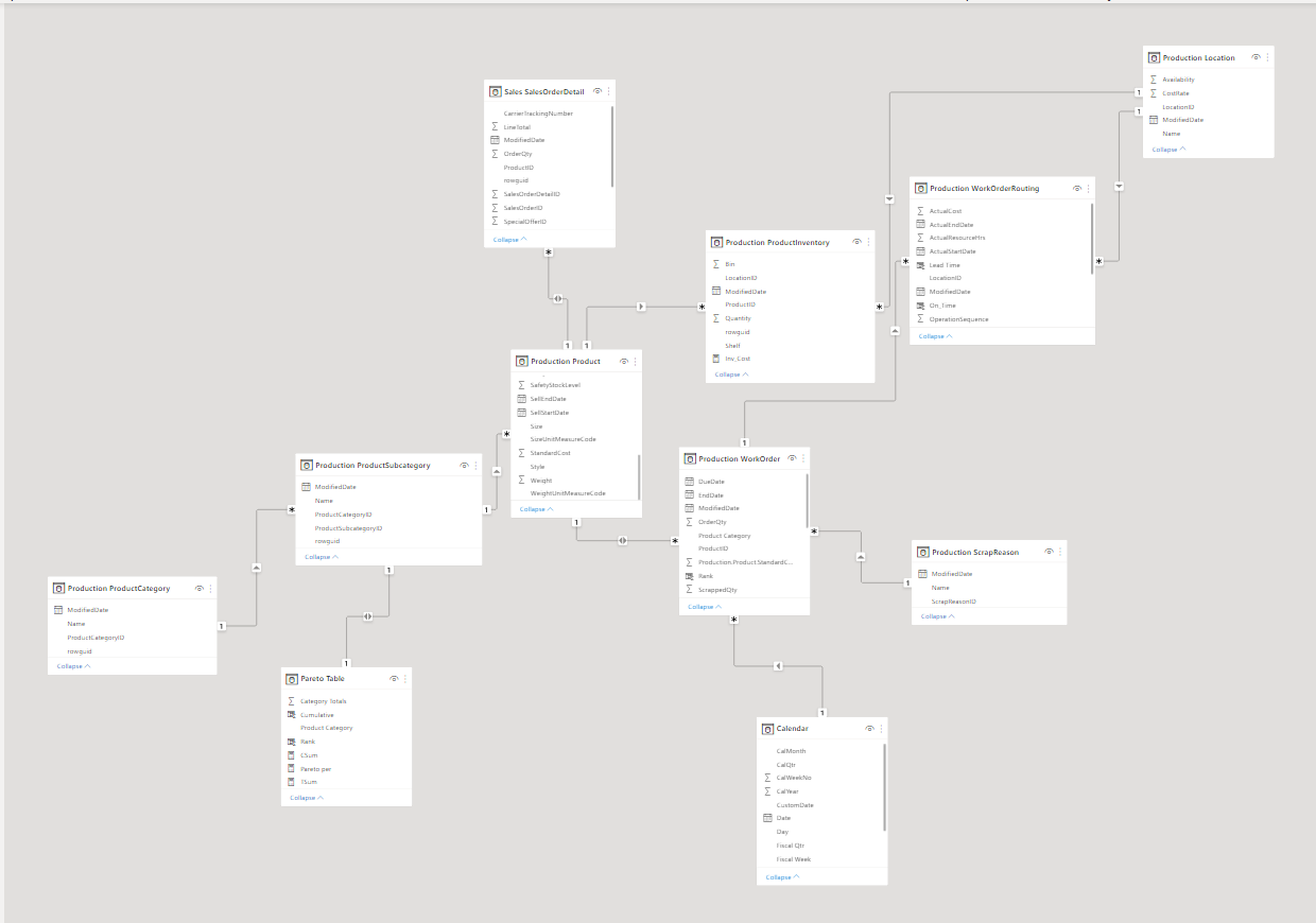
Production Location: Holds assembly data, specifying the parts assigned to manufacture each product along with their assembly location categories.
Production Product: Contains information regarding products, encompassing their physical attributes, pricing, and related details.
Production ProductCategory: Organizes products into distinct categories, providing a structured classification system.
Production ProductSubcategory: Further categorizes products into subgroups, refining the classification of products.
Production ProductInventory: Manages and maintains inventory data specifically for the produced products.
Production ScrapReason: Stores data concerning waste generated during the manufacturing process, detailing reasons for waste occurrence.
Production WorkOrder: Records production transactions and associated data, tracking the progression of production activities.
Production WorkOrderRouting: Contains scheduling details and data related to the routing of production work orders, facilitating the organization of production processes.
Sales SalesOrderDetail: Captures transactional sales data, providing detailed information about sales transactions.
The dashboard is designed to scrutinize manufacturing and inventory functions, featuring an app-style navigational interface. Upon accessing the main page, users are presented with links to two primary sections: Production Overview and Inventory Overview. Each section leads to dedicated pages that further delve into specific details and Key Performance Indicators (KPIs) related to production and inventory, providing a comprehensive breakdown of insights for both aspects separately.
On this dashboard, the fiscal year structure is followed, and a custom date table, generated through DAX, automates the segmentation of fiscal years. The assumption is that each fiscal year commences on October 1st and concludes on September 30th.
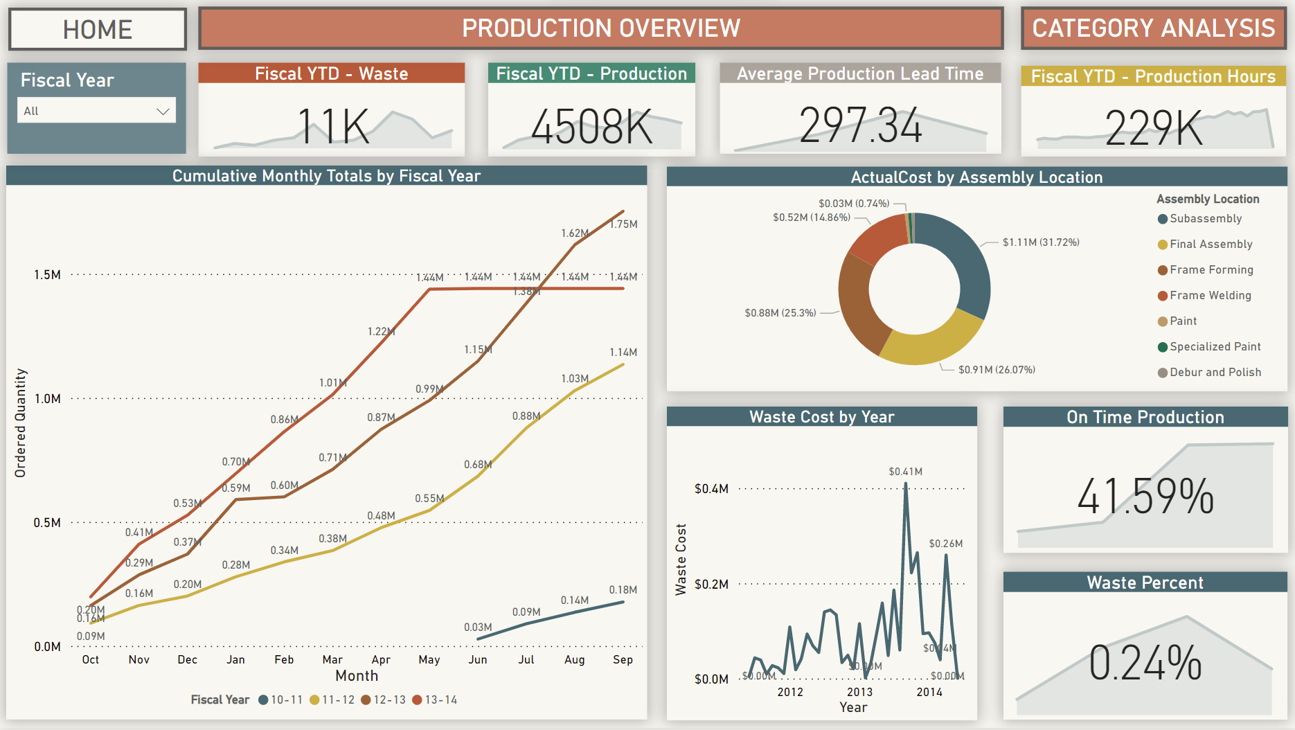
The Manufacturing Overview section provides insights into the company's manufacturing operations. Custom measures were crafted in Power BI to generate specific Key Performance Indicators (KPIs). Below are descriptions of the charts and KPIs displayed:
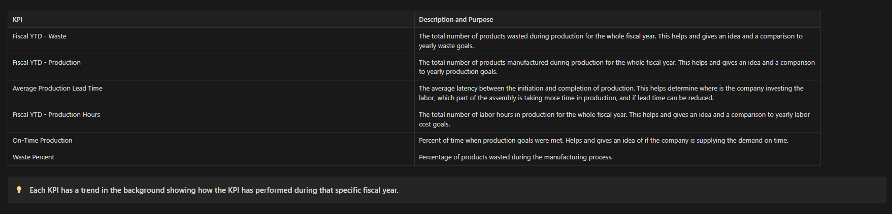
- Cumulative Multiline chart showing Production totals helps compare the fiscal year production trends and helps remove bottlenecks in manufacturing. *
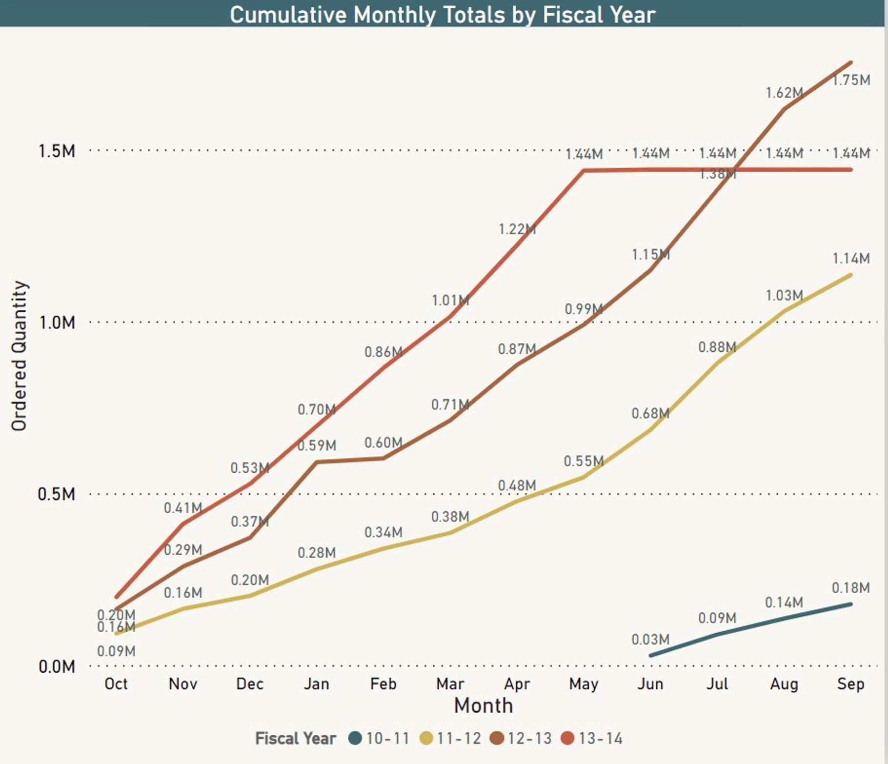
- Donut Chart showing Actual cost distribution over different parts of the assembly line. Helps determine which parts cost more and where improvement is needed so that production costs are reduced. *
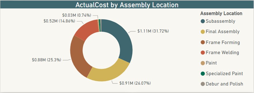
- Waste cost by year line chart. A simple chart showing how much money is the company wasting on discarded products and what is the trend. *
Upon reviewing the manufacturing department's overview, users can access the Product Category Page for a detailed analysis, aiding in the identification of specific manufacturing system issues. This section comprises four charts offering a comprehensive analysis of production components, assisting in pinpointing specific issues within the system.
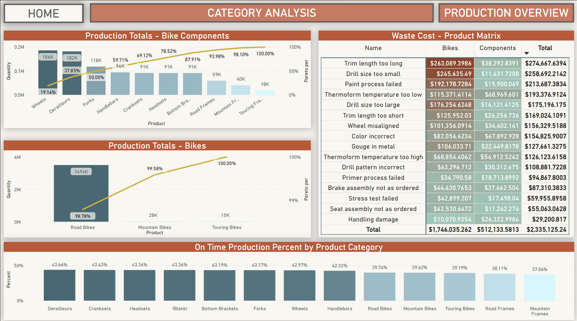
Pareto Charts
The Pareto chart, a type of Bar graph, visually represents frequency or cost, with longer bars indicating higher significance, arranged from left (highest) to right (lowest). Overlapping a line on the bars displays the percentage contribution of each category towards the total, accumulating to demonstrate the cumulative importance of categories in the process. There are two Pareto Charts on this page: one detailing components crucial for bike manufacturing, highlighting areas with high production occupancy, and the other focusing on categories of finished bike products produced.
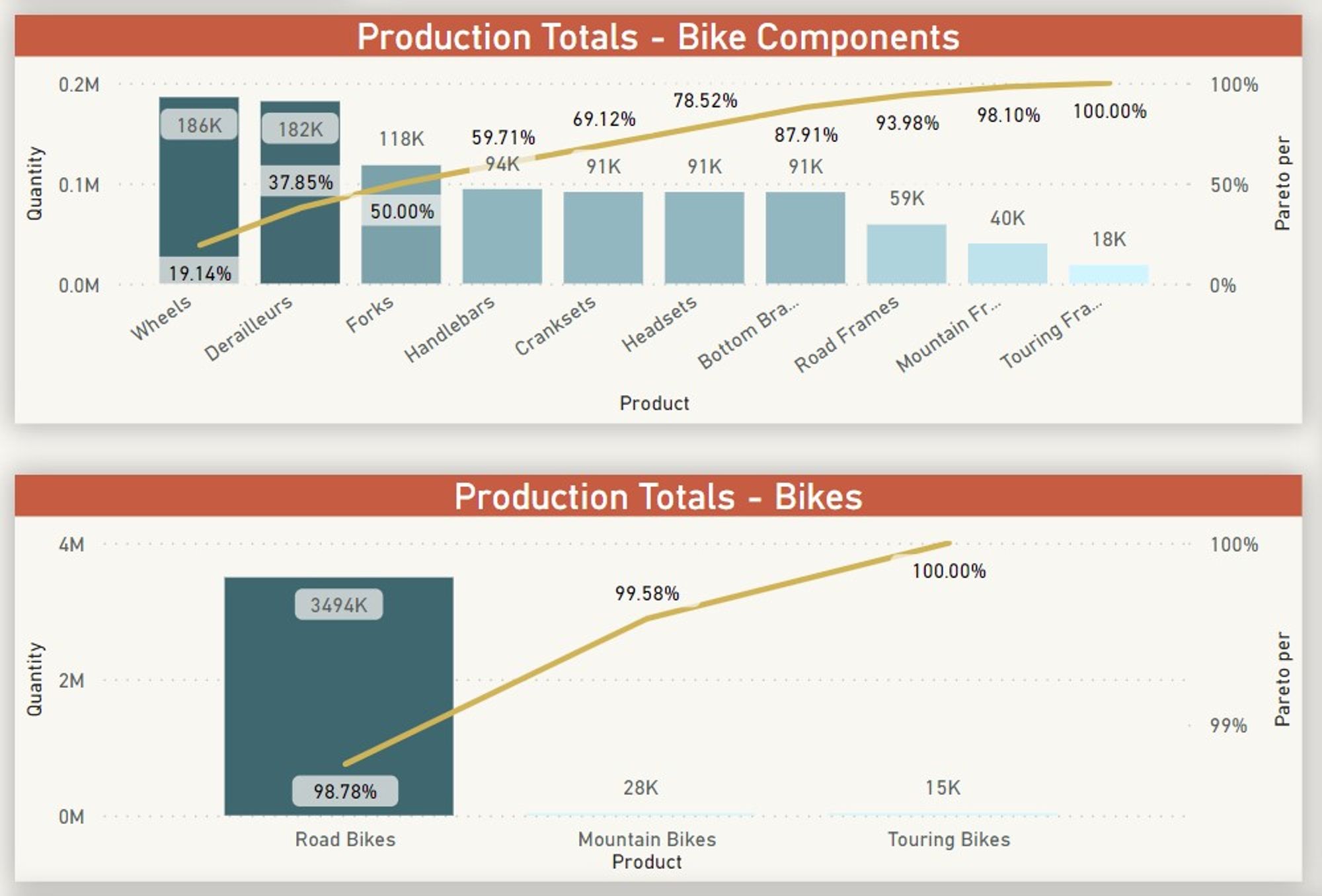
Waste Cost - Product Matrix Visual
The Matrix visual pinpoints the specific areas causing financial loss due to waste within the company and identifies the reasons behind it. The first column outlines the waste reasons, while the subsequent columns categorize the waste into two sections: Bikes (actual bikes wasted during production) and Components (bike components wasted during production). Cost is formatted conditionally to highlight the higher cost portion and its underlying causes. Subtotals are present for both rows and columns, with a grand total showcasing the overall monetary impact of waste.
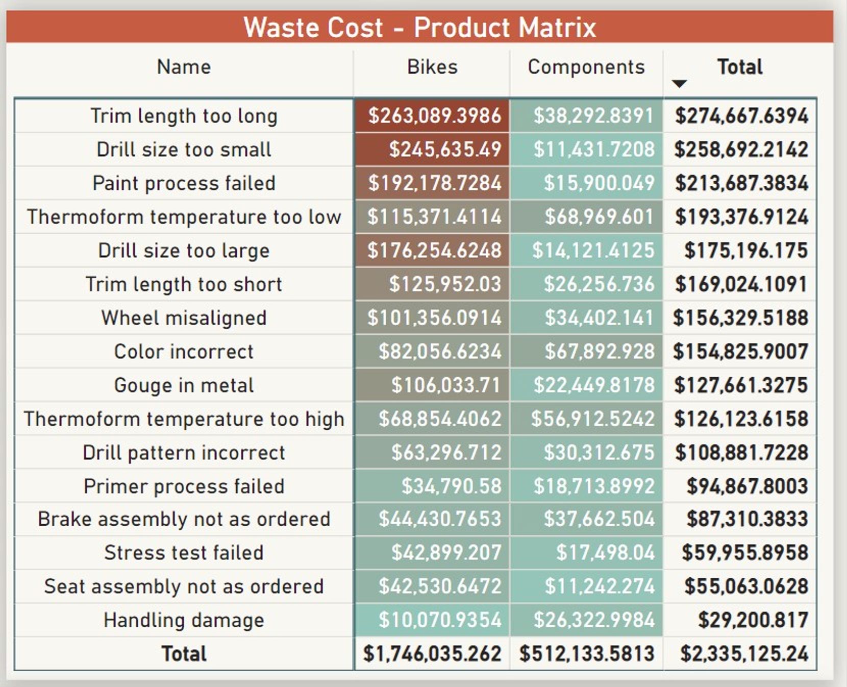
Bar chart
A simple bar chart showing how many Product categories are produced on time.
The Inventory overview section of the dashboard focuses on one location, despite lacking specific data on supply chain distribution within the database. It features three Key Performance Indicators (KPIs), three filters for data segmentation, and two charts on the main page.
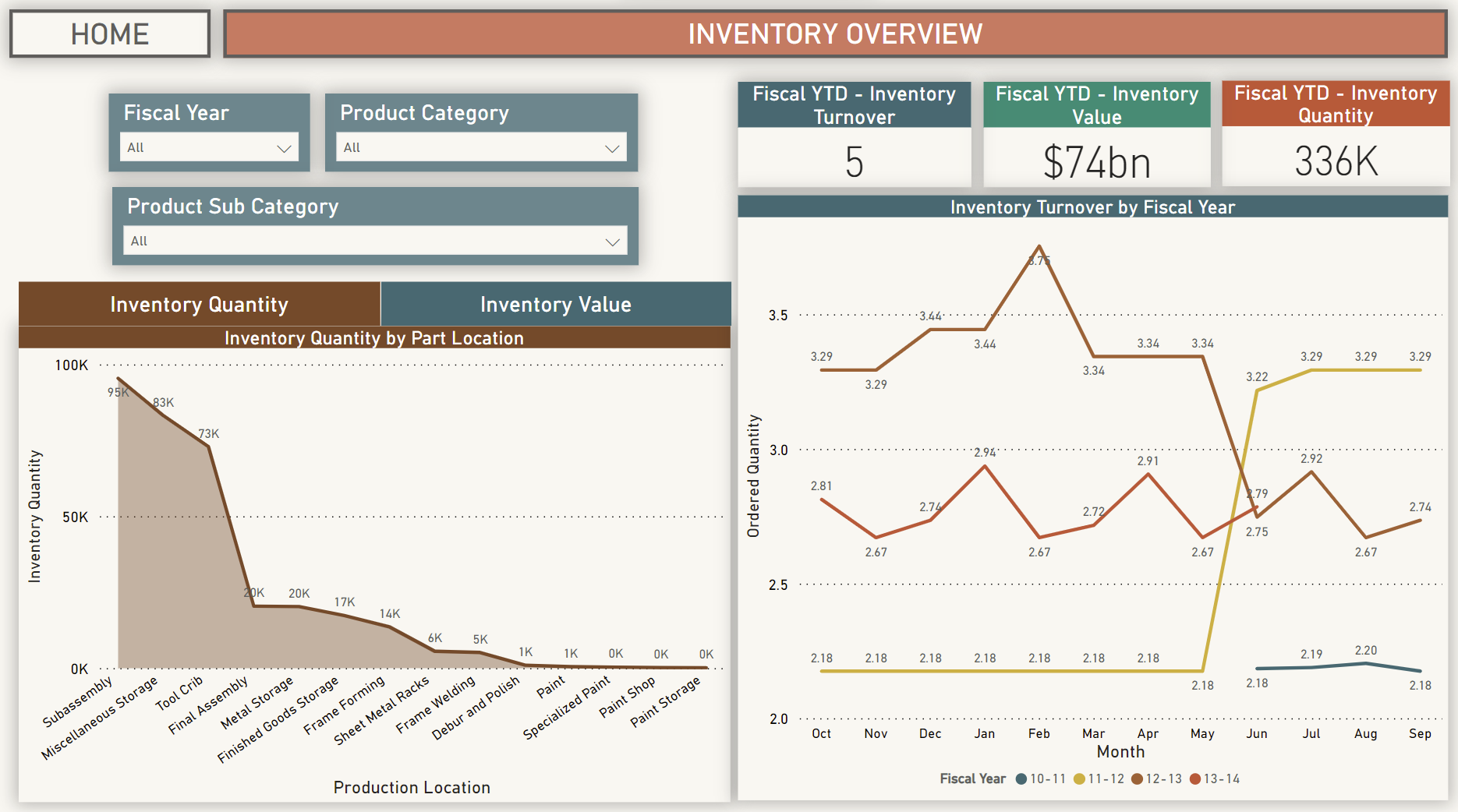
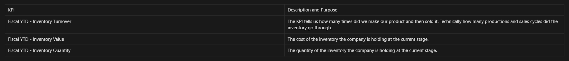
KPIs
Area Charts
Area charts display Inventory quantity and Inventory value categorized by Assembly location. These charts illustrate where the company invests its resources in manufacturing and indicate whether these investments align with profitability. Users can toggle between viewing quantity or value using a button atop the chart.
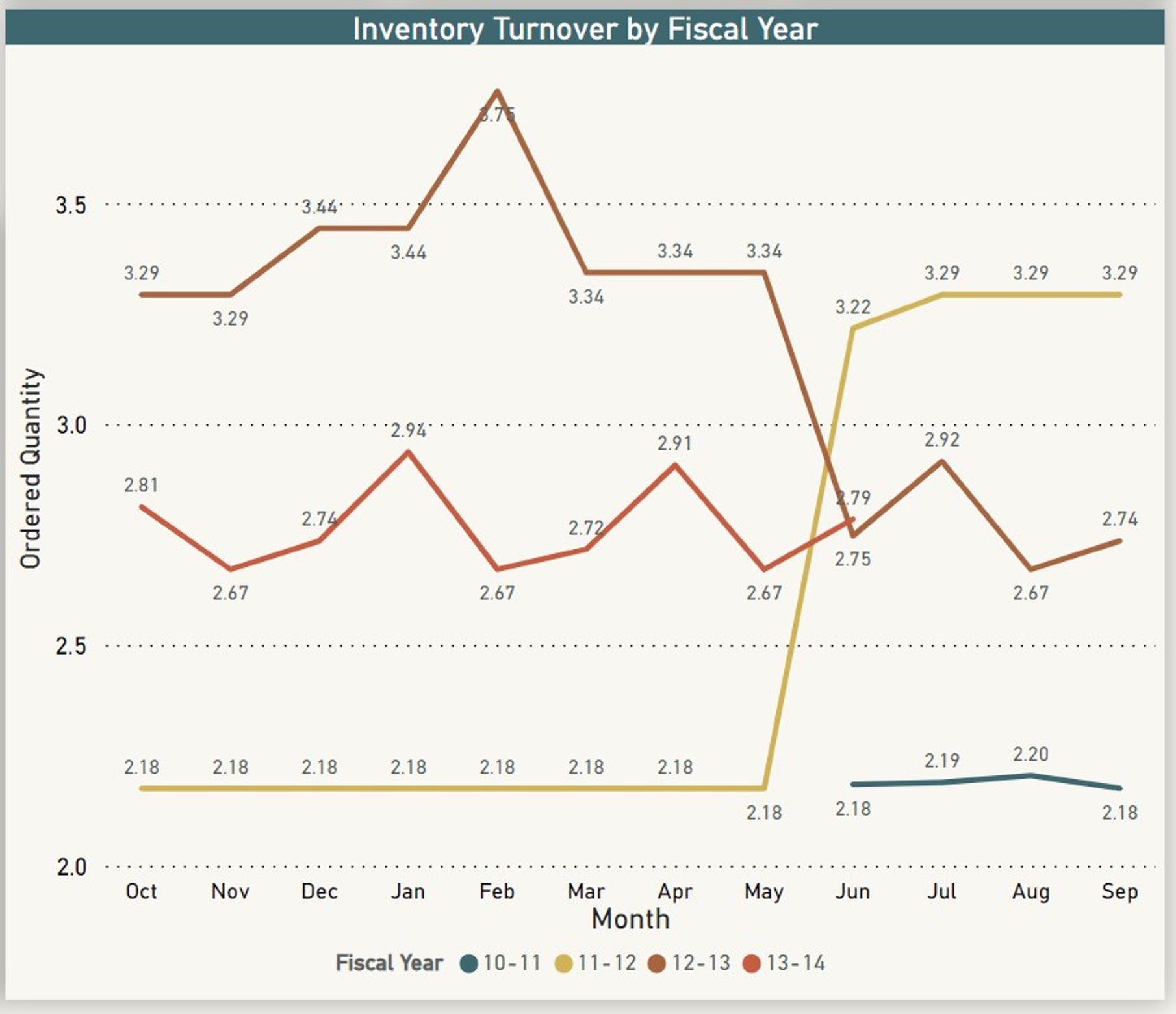
Inventory Turnover Multiline chart
Analyzing inventory turnover across various fiscal years offers valuable insights, revealing historical usage patterns and aiding in more strategic production planning based on past trends.