
react-fit-list is a small headless React utility for rendering a single-line list that never wraps.
When the available width is too small, the list collapses extra items into an overflow affordance such as +3.
It ships with:
- a ready-to-use
<FitList />component - a headless
useFitList()hook for custom renderers - TypeScript types for component and hook APIs
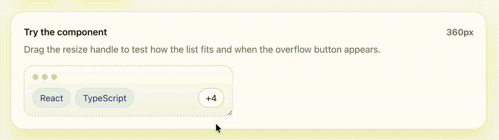
👉 Live demo: https://sincerelyfaust.github.io/react-fit-list/
📦 npm: https://www.npmjs.com/package/react-fit-list
react-fit-list works well for interfaces where wrapping would break the layout, such as:
- tag and chip rows
- recipient lists
- breadcrumbs / metadata rows
- inline filters
- compact table or card cells
npm install react-fit-listimport { FitList } from 'react-fit-list'
const items = [
{ id: 1, label: 'Security' },
{ id: 2, label: 'Startups' },
{ id: 3, label: 'Fintech' },
{ id: 4, label: 'B2B SaaS' },
]
export function Example() {
return (
<div style={{ width: 240 }}>
<FitList
items={items}
getKey={(item) => item.id}
renderItem={(item) => (
<span
style={{
display: 'inline-flex',
alignItems: 'center',
border: '1px solid #d0d7de',
borderRadius: 999,
padding: '4px 10px',
fontSize: 12,
whiteSpace: 'nowrap',
}}
>
{item.label}
</span>
)}
/>
</div>
)
}The package measures the container width and item widths, then determines how many items can fit in a single row. If not all items fit, the remainder is collapsed into an overflow element.
By default:
- the component keeps items on one row
- overflow collapses from the end
- the overflow trigger renders as
+N - item widths are measured from the DOM in
livemode
import { FitList } from 'react-fit-list'| Prop | Type | Description |
|---|---|---|
items |
readonly T[] |
Items to render. |
getKey |
(item: T, index: number) => React.Key |
Returns a stable key for each item. |
renderItem |
(item: T, index: number) => React.ReactNode |
Renders one item. |
| Prop | Type | Default | Description |
|---|---|---|---|
renderOverflow |
(args) => React.ReactNode |
renders +N |
Custom overflow renderer. Receives { hiddenCount, hiddenItems, visibleItems, isExpanded, setExpanded, toggle }. |
className |
string |
— | Class for the root container. |
listClassName |
string |
— | Class for the visible-items wrapper. |
itemClassName |
string |
— | Class for each item wrapper. |
overflowClassName |
string |
— | Class for the overflow trigger wrapper. |
measureClassName |
string |
— | Class for hidden measurement nodes. Use when sizing depends on CSS classes. |
emptyFallback |
React.ReactNode |
null |
Rendered when items is empty. |
gap |
number |
8 |
Pixel gap between items. |
collapseFrom |
'end' | 'start' |
'end' |
Collapse from the end or start of the list. |
overflowPlacement |
'end' | 'closest' |
'end' |
Keep the overflow pinned to the row end or place it next to the hidden segment. |
reserveOverflowSpace |
boolean |
false |
Reserve room for the overflow element even when everything currently fits. |
overflowWidth |
number |
auto | Fixed overflow width in pixels. Useful when the trigger width is known. |
estimatedItemWidth |
number | ((item, index) => number) |
fallback 96 |
Used in estimate mode or before live measurements are available. |
measurementMode |
'live' | 'estimate' |
'live' |
live measures DOM nodes, estimate uses estimatedItemWidth. |
expanded |
boolean |
uncontrolled | Controlled expanded state. |
defaultExpanded |
boolean |
false |
Initial expanded state for uncontrolled usage. |
onExpandedChange |
(expanded: boolean) => void |
— | Called when expanded state changes. |
as |
keyof React.JSX.IntrinsicElements |
'div' |
Root element tag name. |
overflowAs |
keyof React.JSX.IntrinsicElements |
'button' |
Overflow element tag name. |
Use the hook when you want to own the markup but reuse the fitting logic.
import { useFitList } from 'react-fit-list'The hook accepts the same fitting-related options used by the component:
itemsgetKeyreserveOverflowSpaceoverflowWidthgapcollapseFromestimatedItemWidthmeasurementModeexpandeddefaultExpandedonExpandedChangemeasureOverflowWidth
| Field | Type | Description |
|---|---|---|
containerRef |
RefObject<HTMLDivElement | null> |
Attach to the outer container whose width should be measured. |
registerItem(key) |
(node) => void |
Attach to each visible item wrapper. |
registerMeasureItem(key) |
(node) => void |
Attach to hidden measurement nodes for accurate width calculation. |
registerOverflow(node) |
(node) => void |
Attach to the overflow element. |
visibleItems |
T[] |
Items currently visible. |
hiddenItems |
T[] |
Items currently hidden. |
hiddenCount |
number |
Count of hidden items. |
isExpanded |
boolean |
Whether the list is expanded. |
setExpanded |
(expanded: boolean) => void |
Manually set expanded state. |
toggleExpanded |
() => void |
Toggle expanded state. |
recompute |
() => void |
Force a recalculation. |
<FitList
  items={items}
  getKey={(item) => item.id}
  renderItem={(item) => <Tag>{item.label}</Tag>}
  renderOverflow={({ hiddenCount }) => (
    <button type="button">+{hiddenCount}</button>
  )}
/>Useful when the most recent or most important items are at the end.
<FitList
  items={items}
  getKey={(item) => item.id}
  renderItem={(item) => <Tag>{item.label}</Tag>}
  collapseFrom="start"
/>By default, the overflow affordance stays pinned to the far end of the row.
Set overflowPlacement="closest" to make it hug the hidden segment instead.
This is especially useful with collapseFrom="start".
<FitList
  items={items}
  getKey={(item) => item.id}
  renderItem={(item) => <Tag>{item.label}</Tag>}
  collapseFrom="start"
  overflowPlacement="closest"
/>
Estimate mode avoids relying on live measurement for every item and can be useful when item widths are predictable.
<FitList
  items={items}
  getKey={(item) => item.id}
  renderItem={(item) => <Tag>{item.label}</Tag>}
  measurementMode="estimate"
  estimatedItemWidth={(item) => Math.max(72, item.label.length * 8)}
/>FitList does not impose any default click behavior for the overflow trigger. Use renderOverflow to define interactions such as opening a popover, modal, or expanding the list.
Use expanded / onExpandedChange only when you intentionally want to control expansion behavior.
function ControlledExample() {
  const [expanded, setExpanded] = useState(false)

  return (
    <FitList
      items={items}
      getKey={(item) => item.id}
      renderItem={(item) => <Tag>{item.label}</Tag>}
      expanded={expanded}
      onExpandedChange={setExpanded}
    />
  )
}The package is intentionally headless. You control the appearance of the item contents.
For best results:
- keep each rendered item visually compact
- ensure item content does not wrap internally (
white-space: nowrapis usually correct) - use
measureClassNamewhen your measurement nodes need the same CSS as your visible nodes - provide
overflowWidthwhen you know the trigger width and want more predictable calculations
- By default the overflow trigger renders as a
<button>. - When using a custom
renderOverflow, make sure the resulting UI still communicates its action clearly. - If you switch
overflowAsaway frombutton, you are responsible for semantics and interaction behavior.
- the package is safe to render during SSR
- measurements are applied on the client
ResizeObserveris used when available- a
window.resizelistener is also attached as a fallback
A Vite demo app is included in the example/ directory.
cd example
npm install
npm run dev