ToolBoxJS is a Shopify frontend architecture system designed to make theme development more structured, scalable, and maintainable across teams.
This project was originally built before AI-assisted coding became normal, but its core idea is even more relevant now: when many people, components, and rapid iterations collide inside Shopify's constraints, conventions and architecture matter more than ever.
Rather than treating a theme as a loose collection of sections, ToolBoxJS treats it as a system:
- a repeatable component model
- a developer experience layer on top of Shopify
- a workflow for scaling frontend delivery across teams
- a guardrail against entropy in long-lived theme codebases
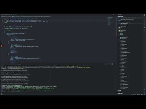
ToolBoxJS is best understood less as a tooling experiment and more as an example of systems thinking applied to Shopify frontend work.
It was built around a practical question:
How do you give a growing Shopify team a consistent way to build interactive sections without letting the codebase turn into a collection of one-off patterns, duplicated setup, and hard-to-maintain behavior?
The answer here was not just "add a build step."
It was to define a development model with clear conventions for:
- how sections are structured
- where markup, schema, styles, and behavior live
- how new work gets scaffolded
- how teams onboard into the same mental model
- how Shopify-specific constraints are handled without sacrificing maintainability
Shopify theme work has a few persistent realities:
- Liquid, schema, CSS, and JavaScript are tightly coupled
- section settings often need to influence rendering and styling
- custom themes grow quickly and stay in production for a long time
- team consistency is usually the difference between speed and chaos
ToolBoxJS was designed to reduce that chaos through structure.
In the AI era, that matters even more. AI can generate implementation faster, but without strong conventions it can also generate inconsistency, duplication, and architectural drift faster. A system like this creates boundaries that make both humans and AI more effective.
Each Shopify section is treated as a self-contained unit with its own:
- Liquid
- styling
- TypeScript behavior
- schema
That structure gives teams a predictable ownership model and makes the codebase easier to navigate as the number of sections grows.
components/
  HeroComp/
    HeroComp.liquid
    HeroComp.scss
    HeroComp.ts
    HeroComp.json
The project standardizes the shape of a section from day one. New components are scaffolded into the same format instead of relying on each developer to invent their own.
That matters because consistency is not just aesthetic. It affects:
- onboarding speed
- code review quality
- maintainability
- refactoring confidence
- the ability to move work across developers without friction
Shopify does not give frontend teams a modern component system out of the box. ToolBoxJS adds a workflow layer on top of that constraint so developers can work with a cleaner authoring model while still outputting Shopify-compatible files.
The goal was not abstraction for its own sake. The goal was to make theme development feel more like working in an intentional frontend system instead of a collection of template fragments.
The bootstrap flow creates the baseline project structure and wires the theme into a predictable development setup. It also reduces easy-to-miss manual steps like asset injection and starter file creation.
That turns setup from tribal knowledge into a repeatable workflow.
The project separates how developers write code from how Shopify ultimately consumes it. That separation is important in maintainable systems because it lets the team optimize for developer clarity without losing platform compatibility.
The codebase includes helpers for Shopify section behavior in the browser, including section refresh patterns and runtime utilities that support more interactive experiences without abandoning Shopify's rendering model.
The component model groups view, styling, schema, and behavior together. That improves local reasoning: a developer can understand a section by opening one folder instead of tracing concerns across the theme.
The CLI scaffolding is a meaningful part of the architecture, not just a convenience feature. It makes the preferred way of building the default way of building.
In other words, the system encodes conventions into workflow.
One of the more practical ideas in the project is allowing authored styles and behavior to remain close to Liquid-driven configuration. That is especially useful in Shopify, where section settings often need to shape presentation directly.
The distributable dist/toolbox.js is generated from source templates and helper files, turning the project into an installable workflow layer rather than a loose set of scripts. That packaging step reflects the broader intent of the repo: make the system portable across projects and teams.
This project is really about helping a Shopify team operate at scale with fewer accidental decisions.
The value shows up in places like:
- faster onboarding into a shared structure
- fewer one-off section implementations
- easier handoff between developers
- more consistent review standards
- cleaner long-term maintenance
- a stronger foundation for interactive theme work
For agencies or in-house ecommerce teams, this kind of structure is often what separates a theme that stays workable from one that becomes fragile after several rounds of growth.
ToolBoxJS was shaped by real platform constraints, including:
- Liquid as the rendering layer
- section schema as a configuration surface
- asset delivery through theme files
- the need to bridge platform-driven markup with modern frontend behavior
The project is useful as a case study because it does not ignore those constraints. It designs around them.
Use the repo in two layers:
src/contains the source templates, helpers, build logic, and development workflow piecesdist/toolbox.jsis the packaged bootstrap artifact intended for use in Shopify theme projects
Important files:
toolbox.config.js: bootstrap CLI templatetoolbox.build.js: packages source templates into the distributable bootstrapsrc/js/helpers/createComp.js: component scaffolding workflowsrc/js/helpers/createSection.js: section generation flow for Shopify themessrc/js/helpers/sectionUtils.js: section runtime helpers
This repo can still be explored and used, but the main value today is architectural.
If you want to inspect or build it:
npm install
npm run build
If you want to understand the workflow it generated for Shopify projects, start by reading:
toolbox.config.jstoolbox.build.jssrc/js/helpers/createComp.jssrc/js/helpers/createSection.js
Beyond the workflow preview above, this README could benefit from a few supporting visuals that reinforce the system-thinking angle rather than just demoing UI.
Recommended placements:
-
Directly under the opening section A short GIF or video preview of the scaffolded workflow: bootstrapping a theme, generating a section, and seeing the output structure.
-
After "A Section-First Architecture" A screenshot of the component folder structure in the editor.
-
After "Developer Experience Built Around Shopify Reality" A short diagram showing the flow from authored component files to Shopify-ready output.
-
After "Team Workflow Value" A screenshot of a generated section alongside its Liquid, TS, SCSS, and schema files to show the convention in practice.
-
Near the end of the README A short architecture diagram showing how source templates, component conventions, and packaged output fit together.
If I were rebuilding this now, I would keep the architectural intent and simplify the implementation layer.
I would likely:
- replace heavier bundling infrastructure with Vite or a lighter modern build approach
- reduce framework and dependency surface area where possible
- design the workflow with AI-assisted generation, code review, and refactoring in mind
- add clearer automated validation around conventions so teams and AI agents can both work safely inside the system
- bias toward fewer moving parts while preserving the same architectural boundaries
The key point is that the ideas still hold. The implementation choices would be lighter today, but the need for strong conventions, component boundaries, and maintainability has only increased.
ToolBoxJS is a snapshot of a specific moment in frontend tooling, but more importantly it is a case study in building for maintainability under platform constraints.
The enduring lesson is not "use this exact stack."
It is that good frontend systems create clarity:
- clarity in structure
- clarity in ownership
- clarity in workflow
- clarity in how a team scales without losing quality
That lesson is timeless, and arguably more important in an AI-assisted development environment than it was when this project was first built.