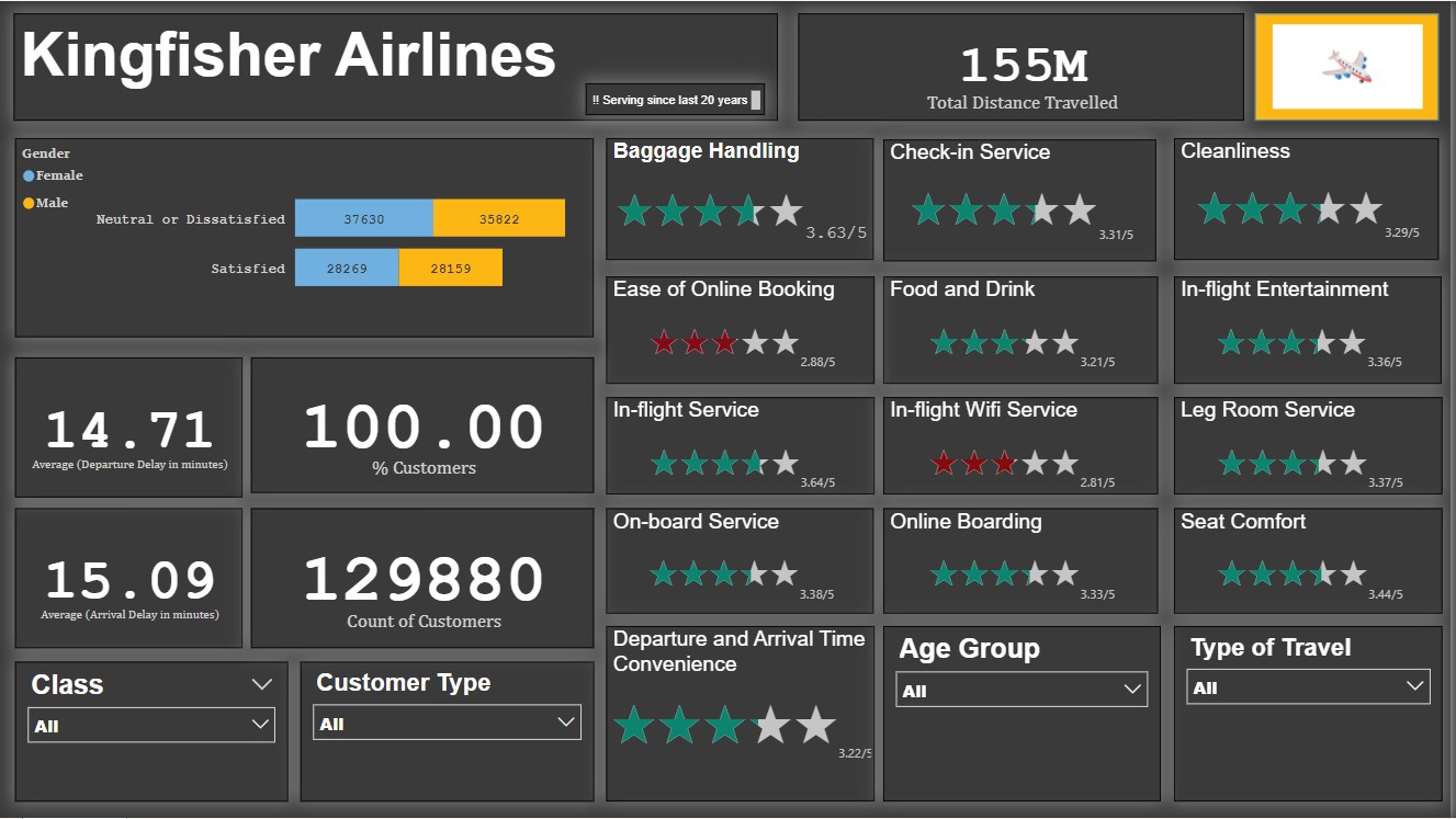
This dashboard enables airlines to better understand their customers. It helps the airlines know if their customers are satisfied with their services. Through different ratings, they get to know their improvement area, & thus they can improve their services by identifying these area. It also lets them know the average delay & departure time, thus, since by using this dashboard they have identified this problem, they can further work on the factors responsible for these unwanted delays.
Since, number of neutral/dissatisfied customers (almost 57 %) are more than satisfied customers (around 43 %), thus in all they must work on improving their services.
-
Step 1 : Load data into Power BI Desktop, dataset is a csv file.
-
Step 2 : Open power query editor & in view tab under Data preview section, check "column distribution", "column quality" & "column profile" options.
-
Step 3 : Also since by default, profile will be opened only for 1000 rows so you need to select "column profiling based on entire dataset".
-
Step 4 : It was observed that in none of the columns errors & empty values were present except column named "Arrival Delay".
-
Step 5 : For calculating average delay time, null values were not taken into account as only less than 1% values are null in this column(i.e column named "Arrival Delay")
-
Step 6 : In the report view, under the view tab, theme was selected.
-
Step 7 : Since the data contains various ratings, thus in order to represent ratings, a new visual was added using the three ellipses in the visualizations pane in report view.
-
Step 8 : Visual filters (Slicers) were added for four fields named "Class", "Customer Type", "Gate Location" & "Type of travel".
-
Step 9 : Two card visuals were added to the canvas, one representing average departure delay in minutes & other representing average arrival delay in minutes. Using visual level filter from the filters pane, basic filtering was used & null values were unselected for consideration into average calculation.
Although, by default, while calculating average, blank values are ignored. -
Step 10 : A bar chart was also added to the report design area representing the number of satisfied & neutral/unsatisfied customers. While creating this visual, field named "Gender" was also added to the Legends bucket, thus number of customers are also seggregated according the gender.
-
Step 11 : Ratings Visual was used to represent different ratings mentioned below,
(a) Baggage Handling
(b) Check-in Services
(c) Cleanliness
(d) Ease of online booking
(e) Food & Drink
(f) In-flight Entertainment
(g) In-flight Service
(h) In-flight wifi service
(i) Leg Room service
(j) On-board service
(k) Online boarding
(l) Seat comfort
(m) Departure & arrival time convenience
In our dataset, Some parameters were assigned a value of 0, representing those parameters are not applicable for some customers.
All these values have been ignored while calculating average rating for each of the parameters mentioned above.
- Step 12 : In the report view, under the insert tab, two text boxes were added to the canvas, in one of them name of the airlines was mentioned & in the other one company's tagline was written.
- Step 13 : In the report view, under the insert tab, using shapes option from elements group a rectangle was inserted & similarly using image option company's logo was added to the report design area.
- Step 14 : Calculated column was created in which, customers were grouped into various age groups.
for creating new column following DAX expression was written;
    Age Group =

    if(airline_passenger_satisfaction[Age]<=25, "0-25 (25 included)",

    if(airline_passenger_satisfaction[Age]<=50, "25-50 (50 included)",

    if(airline_passenger_satisfaction[Age]<=75, "50-75 (75 included)",

    "75-100 (100 included)")))
Screenshot of new calculated column ,

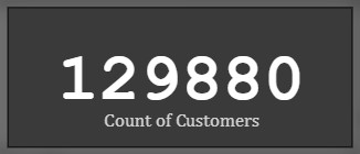
- Step 15 : New measure was created to find total count of customers.
Following DAX expression was written for the same,
Count of Customers = COUNT(airline_passenger_satisfaction[ID])
A card visual was used to represent count of customers.
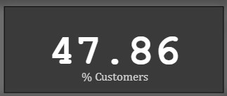
- Step 16 : New measure was created to find % of customers,
Following DAX expression was written to find % of customers,
% Customers = (DIVIDE(airline_passenger_satisfaction[Count of Customers], 129880)*100)
A card visual was used to represent this perecntage.
Snap of % of customers who preferred business class
- Step 17 : New measure was created to calculate total distance travelled by flights & a card visual was used to represent total distance.
Following DAX expression was written to find total distance,
Total Distance Travelled = SUM(airline_passenger_satisfaction[Flight Distance])
A card visual was used to represent this total distance.

- Step 18: The report was then published to Power BI Service.

A single-page report was created in Power BI Desktop & it was then published to Power BI Service.
The following inferences can be drawn from the dashboard;
Number of satisfied Customers (Male) = 28159 (21.68 %)
Number of satisfied Customers (Female) = 28269 (21.76 %)
Number of neutral/unsatisfied customers (Male) = 35822 (27.58 %)
Number of neutral/unsatisfied customers (Female) = 37630 (28.97 %)
Thus, most customers are neutral/unsatisfied.
a) Baggage Handling - 3.63/5
b) Check-in Service - 3.31/5
c) Cleanliness - 3.29/5
d) Ease of online booking - 2.88/5
e) Food & Drink - 3.21/5
f) In-flight Entertainment - 3.36/5
g) In-flight service - 3.64/5
h) In-flight Wifi service - 2.81/5
i) Leg room service - 3.37/5
j) On-board service - 3.38/5
k) Online boarding - 3.33/5
l) Seat comfort - 3.44/5
m) Departure & arrival convenience - 3.22/5
While calculating the average rating, null values have been ignored as they were not relevant for some customers.
These ratings will change if different visual filters are applied.
  a) Average delay in arrival(minutes) - 15.09
  b) Average delay in departure(minutes) - 14.71
The average delay will change if different visual filters are applied.
1.1) 47.87 % customers travelled by Business class.
1.2) 44.89 % customers travelled by Economy class.
1.3) 7.25 % customers travelled by Economy Plus class.
Thus, most customers travelled in Business class.
2.1) 21.69 % customers belong to the '0-25' age group.
2.2) 52.44 % customers belong to the '25-50' age group.
2.3) 25.57 % customers belong to the '50-75' age group.
2.4) 0.31 % customers belong to the '75-100' age group.
Thus, most customers belong to the '25-50' age group.
3.1) 18.31 % customers have customer type 'First time'.
3.2) 81.69 % customers have customer type 'returning'.
Thus, most customers have a customer type of 'returning'.
4.1) 69.06 % customers have travel type 'Business'.
4.2) 30.94 % customers have travel type 'Personal'.