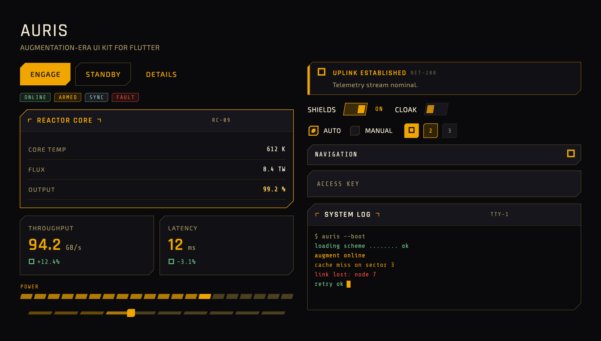
A Flutter UI kit and Material 3 theme system with a warm amber-on-near-black, chamfered "augmentation-era" sci-fi aesthetic — the angular, glowing HUD look of early-2010s sci-fi games, as a drop-in theme plus a library of custom HUD widgets.
▶ Try the live demo — play with every widget in your browser, flip the accent and glow, no install required.
Auris ships as two cooperating layers:
AurisTheme— a fully specifiedThemeData. Add it to yourMaterialAppand every standard Material 3 widget re-skins with no per-widget work.auris_widgets— standalone HUD widgets for patternsThemeDatacannot express: segmented meters, chamfered toggles, scrolling terminals, stat tiles, targeting-reticle ornaments.
It is purely presentational — no state management, routing, or data layer — and has zero runtime dependencies beyond the Flutter SDK.
Requires Flutter ≥ 3.35 / Dart ≥ 3.9.
flutter pub add aurisOr add it to your pubspec.yaml directly:
dependencies:
  auris: ^0.1.0
The required fonts (Rajdhani, Exo 2, Share Tech Mono) are bundled under the SIL Open Font License — no manual font setup. If a bundled font ever fails to load, every text role falls back to a platform sans-serif (or monospace for data readouts), so text always renders rather than showing tofu — there is nothing for a consumer to configure.
import 'package:auris/auris.dart';
import 'package:flutter/material.dart';

void main() => runApp(const MyApp());

class MyApp extends StatelessWidget {
  const MyApp({super.key});

  @override
  Widget build(BuildContext context) {
    return MaterialApp(
      theme: AurisTheme.dark(),   // canonical amber-on-near-black
      home: const HomePage(),
    );
  }
}
That single line re-skins your existing Material widgets. Reach for the custom widgets where you need the HUD patterns Material has no equivalent for:
import 'package:auris/auris_widgets.dart';

AurisPanel(
  title: 'REACTOR CORE',
  code: 'RC-09',
  accent: true,
  child: Column(
    children: const [
      AurisDataRow(label: 'CORE TEMP', value: '612 K'),
      AurisDataRow(label: 'OUTPUT', value: '99.2 %', highlight: true),
    ],
  ),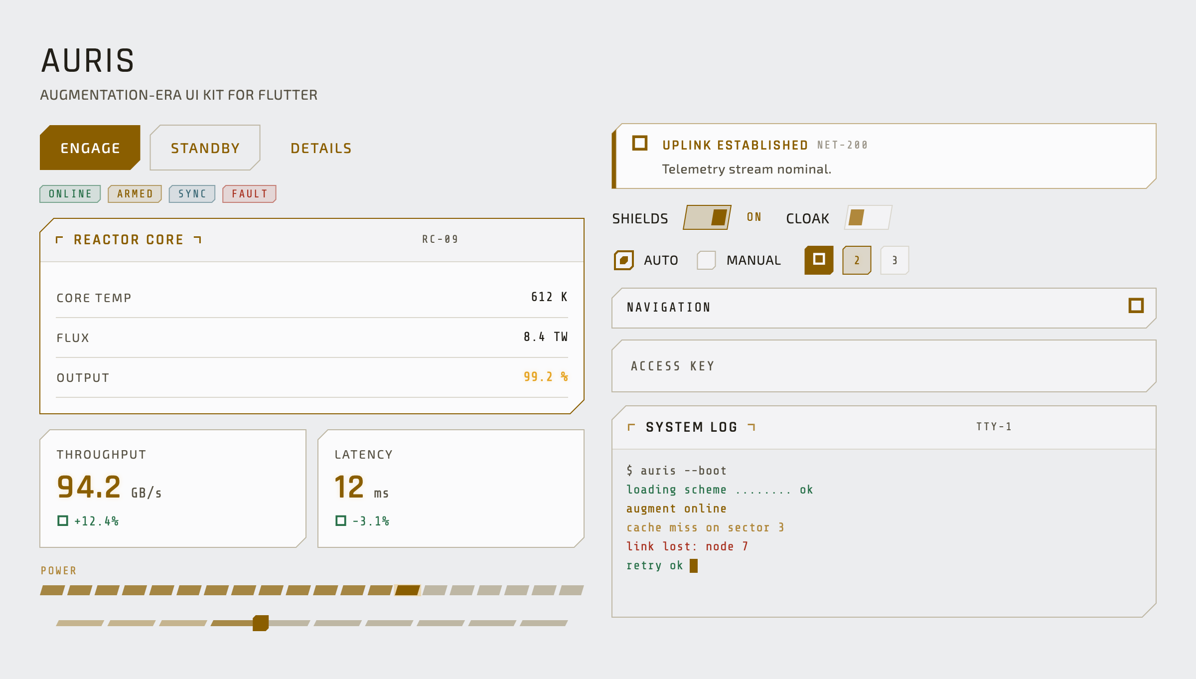
)AurisTheme.dark() is the canonical look; AurisTheme.light() is a clean
technical light variant that keeps the same amber identity (accent darkened for
AA contrast on light surfaces). Both are one resolution with a different
Brightness input and accept the same overrides.
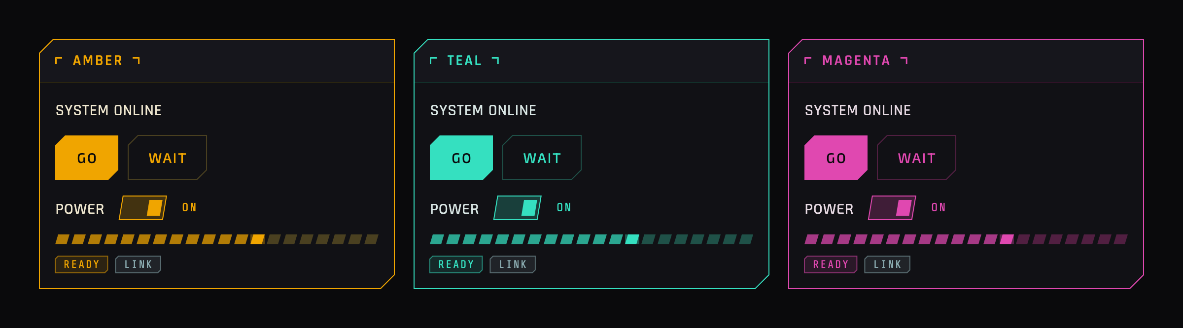
Pass an accent color, a bevelScale, or a glowScale and the change
propagates through both the themed Material widgets and the custom widgets —
including widget-synthesized glows — from one resolved scheme:
MaterialApp(
  theme: AurisTheme.dark(
    accent: const Color(0xFF35E0C0), // recolors the whole kit
    bevelScale: 1.0,                 // corner cut size
    glowScale: 1.5,                  // glow intensity (alpha, not blur)
  ),
);
Two import surfaces:
package:auris/auris.dart— the theme layer:AurisTheme(theThemeDatafactory),AurisScheme(the resolved design scheme that custom widgets read from viaTheme.of(context).extension<AurisScheme>()), and the design tokens.package:auris/auris_widgets.dart— the standalone HUD widget library (the custom widgets reference below).
AurisTheme exposes two static constructors, each returning a fully specified
ThemeData for a MaterialApp:
| Constructor | Returns |
|---|---|
AurisTheme.dark({Color? accent, double bevelScale = 1.0, double glowScale = 1.0}) |
Canonical amber-on-near-black theme. |
AurisTheme.light({Color? accent, double bevelScale = 1.0, double glowScale = 1.0}) |
AA-tuned light variant, same amber identity. |
The accent / bevelScale / glowScale overrides resolve into a single
AurisScheme that propagates through both the themed Material widgets and the
custom widgets — see Customize without forking.
SPEC.md (§spec:scheme, §spec:customization) is the full reference.
All custom widgets read their design values from the resolved AurisScheme, so
they honor accent / bevel / glow overrides and the brightness variant
automatically.
| Widget | Purpose |
|---|---|
AurisContainer |
Foundation chamfered box (border + fill + glow); everything composes from it. |
AurisPanel |
Titled card with corner-bracket ornaments and an optional accent (glowing) mode. |
AurisBadge |
Small monospace status tag (amber / gold / slate / danger / success / inactive). |
AurisNotification |
Inline alert banner with accent bar, icon, message, and dismiss. |
AurisStatCard |
KPI tile: label, large glowing value, unit, and signed delta. |
AurisDataRow |
Key/value row with monospace value, divider, and optional highlight. |
AurisProgressBar |
Segmented meter — the preferred linear-progress replacement. |
AurisSwitch |
Toggle with a true chamfered/slanted track and thumb. |
AurisRadio |
Single-select with a chamfered indicator (Material's radio is circular). |
AurisSelect |
Dropdown with a rotating caret and a chamfered glowing popup. |
AurisStepIndicator |
Chamfered step marker for Stepper.stepIconBuilder or standalone. |
AurisTerminal |
Auto-scrolling monospace log, colored per line type, with a blinking cursor. |
AurisHexOrnament |
Ambient hex-cluster background detail. |
AurisScanBracket |
Targeting-reticle corner brackets around a child. |
The theme layer's promise is that no standard widget renders with default
Material styling. Coverage is measured by a census of every ThemeData
component-theme slot — not by what the demo happens to show — so widgets a real
app reaches for (date/time pickers, scrollbars, banners, menus, navigation
drawers, toggle buttons, …) are in scope, each populated or deliberately
excluded with a recorded reason. See SPEC.md (§spec:theme-layer).
example/— a single scrollable showcase app demonstrating every component. Run it withflutter runfromexample/.SPEC.md— the solution-space source of truth (architecture, tokens, theme layer, custom widgets, accessibility, motion).REQUIREMENTS.md/ROADMAP.md— problem space and remaining work.
Primary text and interactive controls meet WCAG AA contrast; intentionally dim tokens are decorative-only. Every interactive widget exposes visible keyboard focus. Animations respect the platform reduced-motion setting and the showcase targets 60fps including glow, chamfer clipping, and segmented bars.
BSD 3-Clause — see LICENSE.