A drag & drop page builder for React - with your own components.



Live demo · Documentation · Changelog
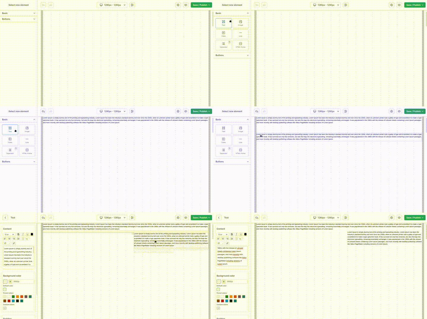
react-web-builder gives you two components:
<WebBuilder />- the editor. A responsive, zoomable grid where users drag components, edit their properties in a sidebar and design per breakpoint.<View />- the renderer. It takes thepageobject produced by the editor and renders the final page. No editor code, no editing UI.
The key idea: every component in the palette can be your own React component. You describe it once (id, label, icon, editable properties) and the builder generates the whole editing experience for it - inputs, color pickers, rich text editors, image uploads and so on.
Typical use cases: landing page builders inside a SaaS, CMS page editors, email/newsletter layout tools, white-label site builders for your customers.
- 🧩 Bring your own components - any React component becomes a drag & drop block
- 🎛️ Declarative property editor - 20+ property types (text, number, color, richtext, image, url, border, padding, select, list, array, object…)
- 📱 Responsive by design - multiple breakpoints, each with its own grid, columns and layout
- 🖱️ Grid with pan & zoom - powered by
react-grid-panzoom - ✍️ Rich text editing - Slate-based, with colors, links, alignment and font options
- 🧱 Templates - start users from a prepared layout instead of a blank canvas
- 🔤 Custom fonts - declare fonts (e.g. Google Fonts) selectable in page settings
- 🌍 i18n - full translation support via
i18next - 🖼️ Image upload hook - plug in your own storage/CDN
- 💡 Builder hints & custom navbar icons - onboard users and add your own toolbar actions
- 🔒 TypeScript first - types shipped for every entry point
- 📦 ESM + CJS builds, tree-shakable subpath exports
npm install react-web-builder
# or
yarn add react-web-builder
# or
pnpm add react-web-builder
Peer dependencies: react >= 18.2.0 and react-dom >= 18.2.0.
import WebBuilder from 'react-web-builder'

export function Editor() {
  const onPublish = async (page) => {
    // `page` is a plain, serializable object - store it wherever you like
    await fetch('/api/pages/home', {
      method: 'PUT',
      headers: { 'Content-Type': 'application/json' },
      body: JSON.stringify(page),
    })
  }

  return <WebBuilder onPublish={onPublish} />
}import View from 'react-web-builder/View'
export function Page({ page }) {
return <View page={page} />
}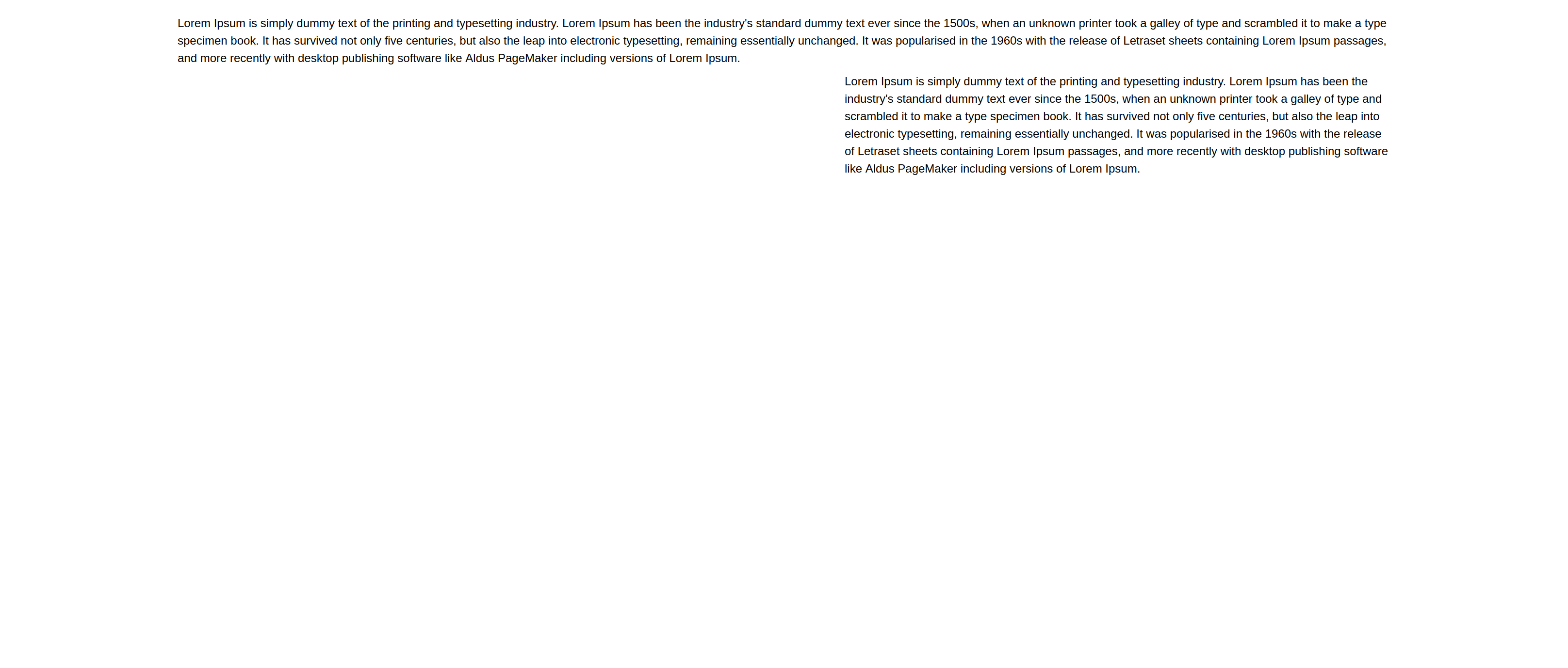
⚠️ Rule of thumb: every prop you pass to<WebBuilder />that affects rendering -components,container,fonts,transformElementProperty, thedefault*props - must also be passed to<View />. Otherwise the published page will not render the same way it looked in the editor.
import { useEffect, useState } from 'react'
import WebBuilder from 'react-web-builder'

export function EditorWithPersistence() {
  const [page, setPage] = useState(null)
  const [loading, setLoading] = useState(true)

  useEffect(() => {
    fetch('/api/pages/home')
      .then((res) => res.json())
      .then(setPage)
      .finally(() => setLoading(false))
  }, [])

  if (loading) return <p>Loading…</p>

  return (
    <WebBuilder
      page={page ?? undefined}      // undefined => start from an empty page
      onAutoSave={(next) => save(next, 'draft')}
      onSaveAsDraft={(next) => save(next, 'draft')}
      onPublish={(next) => save(next, 'published')}
      onExit={async () => { window.location.href = '/dashboard' }}
    />
  )
}

const save = (page, status) =>
  fetch('/api/pages/home', {
    method: 'PUT',
    headers: { 'Content-Type': 'application/json' },
    body: JSON.stringify({ page, status }),
  })
onAutoSave only fires when the user enables Auto save in the configuration menu (top-right corner). onChange fires on every change - use it for undo stacks or live previews, not for network calls.
Out of the box the palette contains:
| Component | id | Notes |
|---|---|---|
| Container | Container |
Section wrapper with its own columns, background, padding, background image |
| Text | Box |
Rich text block |
| Image | Image |
With upload support, link, border, shadow |
| Video | Video |
Powered by react-player |
| Custom button | CustomButton |
Toggle with defaultButtonAvailable |
| Line | Line |
Solid / dashed, configurable thickness and radius |
| Separator | Separator |
Vertical spacing |
| iFrame | Iframe |
Embed external content |
| Anchor | Anchor |
In-page scroll target |
| HTML | HTMLComponent |
Raw HTML snippet |
You can extend this list with components - your components are merged into the palette and grouped in the sidebar. Registering a component under an existing id overrides that built-in instead of adding a second entry, which is the easiest way to swap an icon, a label or an implementation.
Container is special: it owns a nested grid, so users can build real sections rather than a flat stack of blocks. Your own components can do the same with isContainer and the useElementContainer hook - see containers.
import WebBuilder from 'react-web-builder'

const Pricing = () => <div className="pricing">Our plans</div>

const components = [
  {
    id: 'pricing',
    label: 'Pricing table',
    component: Pricing,
  },
]

export const Editor = () => <WebBuilder components={components} />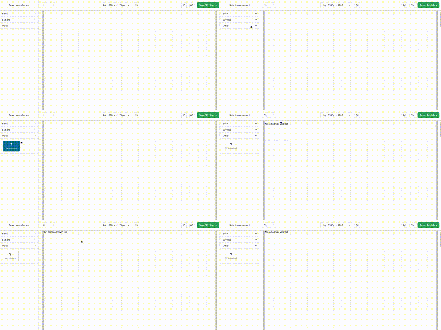
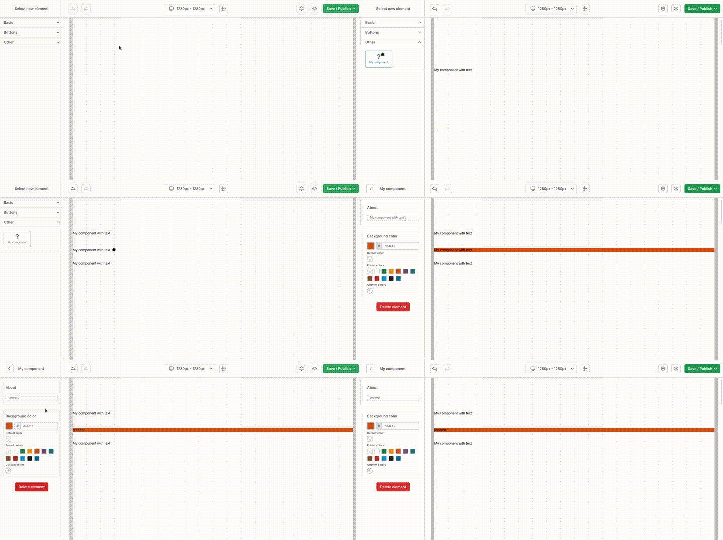
Each entry in props becomes a field in the sidebar and is passed to your component as a prop with the same id.
const Hero = ({ title, subtitle, backgroundColor, ctaUrl, rounded }) => (
  <section style={{ backgroundColor, borderRadius: rounded ? 16 : 0, padding: 40 }}>
    <h1>{title}</h1>
    <p>{subtitle}</p>
    <a href={ctaUrl?.location} target={ctaUrl?.openInNewTab ? '_blank' : undefined}>
      Get started
    </a>
  </section>
)

const components = [
  {
    id: 'hero',
    label: 'Hero section',
    component: Hero,
    icon: HeroIcon,                 // optional React component
    defaultWidth: 12,               // in grid columns
    group: { id: 'marketing', label: 'Marketing', order: 1 },
    order: 0,
    props: [
      { id: 'title',           label: 'Title',            type: 'text',   defaultValue: 'Ship faster' },
      { id: 'subtitle',        label: 'Subtitle',         type: 'text',   defaultValue: 'Build pages without a developer' },
      { id: 'backgroundColor', label: 'Background',       type: 'color',  defaultValue: '#f8f8f8' },
      { id: 'rounded',         label: 'Rounded corners',  type: 'toggle', defaultValue: true },
      { id: 'ctaUrl',          label: 'Button link',      type: 'url',    canOpenInNewTab: true },
    ],
  },
]
| Type | Value shape | Use for |
|---|---|---|
text |
string |
Single-line input |
number |
number |
Range slider between min and max (default 0–20) |
toggle |
boolean |
On/off switch |
color |
string (hex) |
Color picker |
select |
string |
Dropdown, needs options[] |
richtext |
TextElement[] |
Slate rich text - render with <Box /> |
fontOptions |
FontOptions |
Font styling for static text |
fontFamily |
string |
Font selector |
html |
HTMLComponentValue |
Raw HTML textarea |
img |
{ location, upload } |
Image picker + upload |
backgroundImage |
BackgroundImage |
Background image with sizing |
url |
{ location, openInNewTab } |
Link field |
padding |
{ top, right, bottom, left } |
Spacing helper |
border |
{ top, right, bottom, left, radius, color } |
Border helper |
boxShadow |
string |
Shadow picker |
list |
ListOptions |
Draggable list |
array |
unknown[] |
Repeating group, needs of |
object |
Record<string, unknown> |
Nested group of fields, needs of |
about |
- | Info box with optional button (see onAboutClick) |
hidden |
unknown |
Value kept in the page, no UI |
Full reference: docs/01-COMPONENTS.md.
richtext values are Slate documents. Use the exported Box component to render them faithfully:
import Box from 'react-web-builder/Box'

const Quote = ({ content, author }) => (
  <blockquote>
    <Box content={content} />
    <cite>{author}</cite>
  </blockquote>
)

const components = [
  {
    id: 'quote',
    label: 'Quote',
    component: Quote,
    props: [
      { id: 'content', label: 'Quote', type: 'richtext', colorAvailable: true, hyperlinkAvailable: true },
      { id: 'author',  label: 'Author', type: 'text' },
    ],
  },
]
Need the raw styles instead of the markup? react-web-builder/useBoxStyle returns a React.CSSProperties object from border / boxShadow values.
Every property accepts a visibility function. Return a truthy value to show the field.
props: [
  { id: 'showAvatar', label: 'Show avatar', type: 'toggle' },
  {
    id: 'avatarColor',
    label: 'Avatar color',
    type: 'color',
    visibility: ({ formValues }) => formValues.showAvatar,
  },
  {
    id: 'mobileOnlyNote',
    label: 'Mobile note',
    type: 'text',
    visibility: ({ breakpoint }) => breakpoint.from < 768,
  },
]
The callback receives { breakpoint, element, formValues, prop }.
transformElementProperty lets you rewrite stored values on their way to your components - signing image URLs, prefixing routes, resolving CMS ids:
import WebBuilder, {
  WebBuilderComponentProperty,
  WebBuilderElementProperty,
} from 'react-web-builder'

const transformElementProperty = (
  componentProp: WebBuilderComponentProperty,
  elementProp: WebBuilderElementProperty,
): unknown => {
  if (componentProp?.type !== 'img') return elementProp.value
  return { ...elementProp.value, location: toCdnUrl(elementProp.value.location) }
}

<WebBuilder transformElementProperty={transformElementProperty} />
// remember to pass the same function to <View />Pages are responsive: each breakpoint has its own grid and its own element layout. Defaults are 360px (mobile) and 1280px (desktop); users can change them in the UI, or you can define them up front.
import WebBuilder, { Page } from 'react-web-builder'

const page = {
  breakpoints: [
    {
      id: 'mobile',
      from: 360,
      to: null,           // null => up to 100% of the available space
      cols: 5,
      rowHeight: 15,
      backgroundColor: '#f8f8f8',
      padding: { top: 15, left: 15, right: 15, bottom: 0 },
    },
    {
      id: 'desktop',
      from: 1280,
      to: null,
      cols: 10,
      rowHeight: 15,
      backgroundColor: '#f8f8f8',
      padding: { top: 15, left: 15, right: 15, bottom: 0 },
    },
  ],
} as Page

export const Editor = () => <WebBuilder page={page} />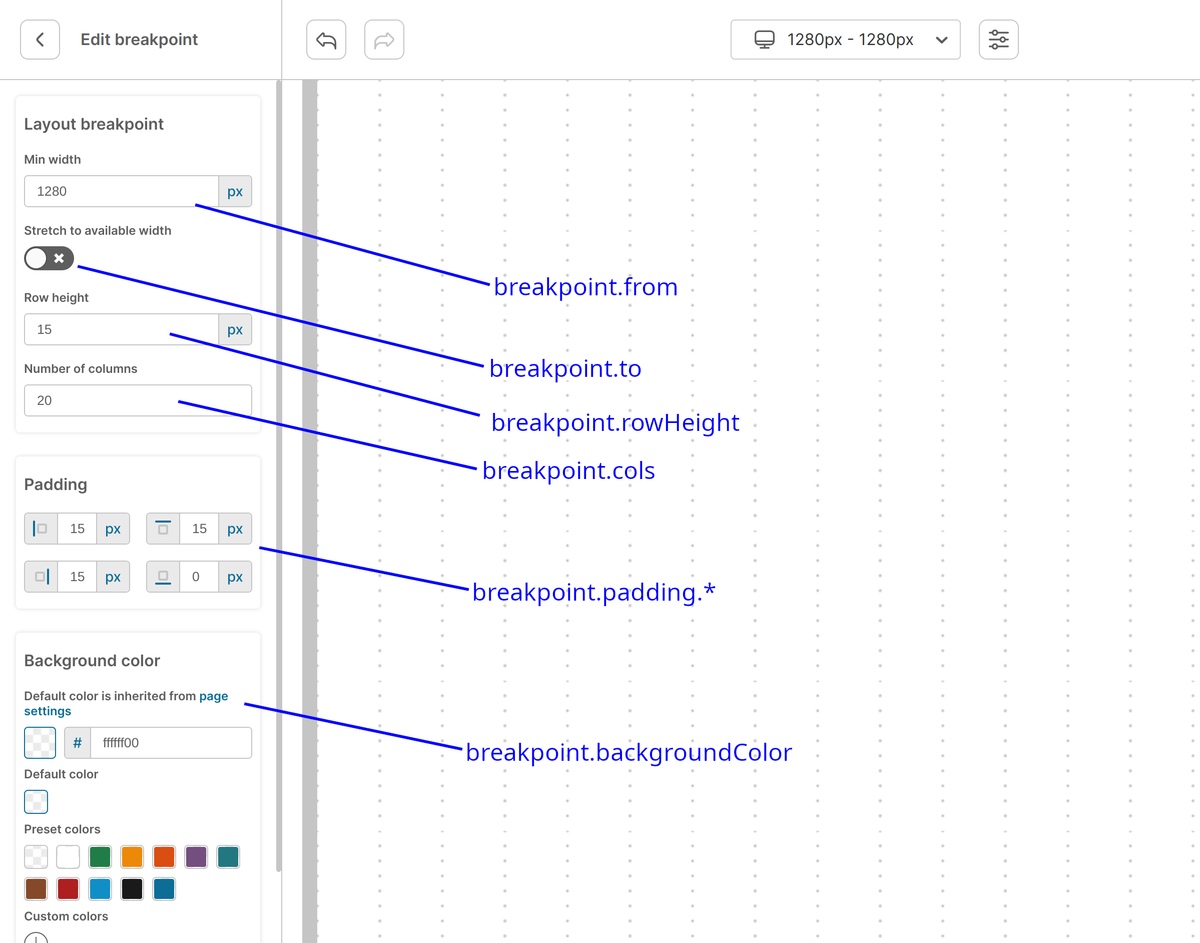
More: docs/03-BREAKPOINTS.md.
A template is a tree (row / column / component / fixed nodes) attached to a breakpoint. It is applied when the builder opens, so users start from a real layout instead of an empty grid.
const templateDesktop: Tree = {
  id: 'root',
  type: 'row',
  w: 10,
  marginTop: 0, marginBottom: 0, marginLeft: 0, marginRight: 0,
  children: [
    {
      id: 'heading',
      type: 'component',
      w: 8,
      marginTop: 0, marginBottom: 0, marginLeft: 2, marginRight: 0,
      element: { id: 'el-1', componentName: 'Box', props: [], h: 'auto', x: 0, y: 0, w: 8 },
    },
  ],
}

const page = {
  breakpoints: [{ id: 'desktop', from: 1280, to: null, cols: 10, rowHeight: 15,
                  padding: { top: 15, left: 15, right: 15, bottom: 0 },
                  template: templateDesktop }],
} as Page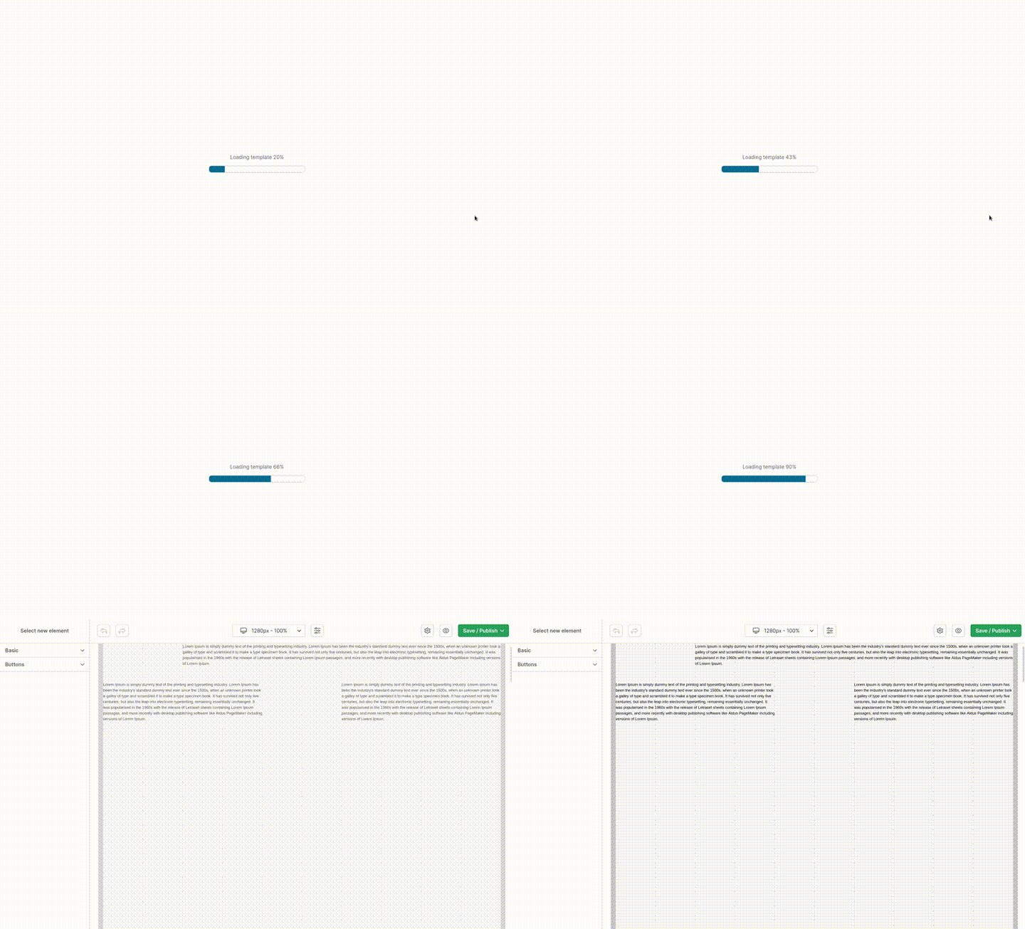
Pair it with onTemplateRestart to let users reset back to the starting layout. Full example: docs/04-TEMPLATES.md.
import WebBuilder, { FontImport } from 'react-web-builder'

const fonts: FontImport[] = [
  {
    label: 'Inter',
    value: 'inter',
    fontFamily: "'Inter', sans-serif",
    stylesheet: (
      <>
        <link rel="preconnect" href="https://fonts.googleapis.com" />
        <link rel="preconnect" href="https://fonts.gstatic.com" />
        <link href="https://fonts.googleapis.com/css2?family=Inter:wght@400;700&display=swap" rel="stylesheet" />
      </>
    ),
  },
]

<WebBuilder fonts={fonts} page={{ fontFamily: 'inter' }} />
Pass the same fonts array to <View />. More: docs/05-FONTS.md.
onImageUpload receives the file and must resolve to { location, upload }:
import WebBuilder, { OnImageUpload } from 'react-web-builder'

const onImageUpload: OnImageUpload = async (file) => {
  const data = new FormData()
  data.append('file', file as Blob)

  const res = await fetch('/api/upload', { method: 'POST', body: data })
  if (!res.ok) throw new Error('Upload failed')

  const { location } = await res.json()
  return { location, upload: { status: 'ok' } }
}

<WebBuilder onImageUpload={onImageUpload} />
Throwing inside the callback surfaces an error toast to the user. More: docs/09-IMAGE-UPLOAD.md.
English lives in src/locales/en.ts. Pass a translations object with the same shape plus a locale key:
const translations = {
  locale: 'pl',
  // …the rest of the keys, translated
}

<WebBuilder translations={translations} />
More: docs/06-TRANSLATIONS.md.
Onboard users with one-off hints (dismissal is remembered in local storage) and add your own toolbar actions:
<WebBuilder
  builderHints={[
    { selector: '[data-id="navbar-button"]', title: 'Save your page here', hasButton: true },
  ]}
  navbarIcons={[
    {
      id: 'preview',
      icon: () => <EyeIcon />,
      tooltip: 'Open preview in a new tab',
      onClick: ({ page }) => openPreview(page),
    },
  ]}
/>
More: hints · navbar icons.
container wraps everything rendered on the grid - in both the builder and the view - so the editor matches your real site chrome:
const Container = ({ backgroundColor, breakpoint, page, children }) => (
  <div className="site-shell" style={{ backgroundColor }}>
    <SiteHeader />
    {children}
    <SiteFooter />
  </div>
)

<WebBuilder container={Container} />
<View container={Container} page={page} />Accepts everything in the shared table below, plus:
| Prop | Type | Description |
|---|---|---|
builderHints |
HelperArrowItem[] |
One-off hints pointing at DOM selectors |
enableDownload |
boolean |
Show "download page" action |
enableUpload |
boolean |
Show "upload page" action |
navbarIcons |
WebBuilderNavbarIcon[] |
Extra toolbar buttons |
pageSettingsExtra |
WebBuilderComponentProperty[] |
Extra fields in page settings (same shape as component props) |
presetColors |
string[] |
Colors shown under "Preset colors" in the picker |
onAutoSave |
(page) => void |
Fires on change when Auto save is enabled |
onChange |
(page) => void |
Fires on every change |
onAboutClick |
(button) => void |
Click on an about property button |
onBeforeDownloadPage |
(page) => { filename?, page? } |
Adjust the downloaded file |
onExit |
() => Promise<void> |
"Exit" in the Save / Publish menu |
onImageUpload |
(file) => Promise<ImageURL> |
See image upload |
onPublish |
(page) => Promise<unknown> |
"Publish" |
onSaveAsDraft |
(page) => Promise<unknown> |
"Save as draft" |
onPagePreview |
(page) => Promise<unknown> |
Preview icon |
onTemplateRestart |
() => Page |
Return a fresh page when the user restarts the template |
| Prop | Type | Description |
|---|---|---|
components |
WebBuilderComponent[] |
Your components |
container |
React.ElementType |
Wrapper receiving backgroundColor, breakpoint, page |
elementContainerDecorator |
React.ElementType |
Wrapper around each element on the grid |
defaultBoxContent |
TextElement[] |
Default content of the Text component |
defaultButtonAvailable |
boolean |
Show the custom button component |
defaultButtonBackgroundColor |
string |
Default button color (hex) |
defaultButtonContent |
TextElement[] |
Default button label |
defaultButtonHref |
string |
Default button link |
defaultImageSrc |
string |
Placeholder image |
defaultVideoSrc |
string |
Placeholder video |
fonts |
FontImport[] |
Available fonts |
translations |
Translations |
UI translations |
transformElementProperty |
TransformElementProperty |
Rewrite property values before render |
page |
Page |
Page to load (required on <View />) |
Plain JSON, safe to store in any database:
| Field | Type | Description |
|---|---|---|
breakpoints |
Breakpoint[] |
Grid definition per breakpoint |
elementsInBreakpoints |
internal | Elements placed in each breakpoint |
elementsExtras |
internal | Margins and paddings of elements |
backgroundColor |
string |
Page background |
colors |
internal | Colors saved by the user |
fontFamily |
string |
Selected font |
More: docs/02-PAGE.md.
| Import | Contents |
|---|---|
react-web-builder |
WebBuilder (default) + all types |
react-web-builder/View |
View (default) + types |
react-web-builder/Box |
Box - renders richtext values |
react-web-builder/useBoxStyle |
useBoxStyle - border/shadow → CSSProperties |
react-web-builder/components |
Box, Image, Line, Video, IFrame, useElementContainer |
- Introduction
- Components
- Page object
- Breakpoints
- Templates
- Fonts
- Translations
- Builder hints
- Navbar icons
- Image upload
- Containers
- The editor
Requires pnpm ^10.
pnpm install
pnpm dev            # Storybook playground on http://localhost:6006
pnpm test           # unit tests (vitest)
pnpm e2e            # end-to-end tests (playwright)
pnpm lint           # biome lint --write
pnpm format         # biome format --write
pnpm build:lib      # type-check + build the library
pnpm build:demo     # build the static Storybook demo
Stories in src/stories double as living examples - Builder.stories.tsx, Templates.stories.tsx, View.stories.tsx and friends mirror the docs above.
Issues and pull requests are welcome - open an issue first for larger changes. Releases are managed with changesets: run pnpm changeset and describe your change in the PR.
MIT © sasza